


TL;DR
Part 1 showed how Alexa for Shopping (AFS) groups products into semantic shelves and explains its recommendations. Part 2 puts numbers on position. We calculated median reviews, displayed prices and star ratings for every observed position across Fashion, consumer packaged goods (CPG), Electronics and Home, then traced the publishers Alexa cites back to the exact products they describe. The priority from Part 1 still holds: prepare each product for the missions it can credibly serve.
Read position in three coordinates. Overall position, shelf order and position within the semantic shelf describe different kinds of visibility. Record all three.
Use benchmarks as context. Median P1 profiles differ sharply by category. They describe what appeared, not thresholds a product must reach.
Read review depth alongside ratings. Review counts thin out deeper in the answer while median ratings barely move.
Open the cited page. Leading domains differ by category, and a citation can describe the right model under a different label.
Fix the page, then repeat the request. Correct one documented fact on one exact offer, then measure accuracy, inclusion, position and commercial results separately.
The question Part 1 left open
A product can lead its semantic shelf and still sit eighth or later in the answer. In Part 1, we found that 64.52% of products leading their own shelf appeared below first position overall. Review depth was consistently associated with earlier placement while Fashion star ratings overlapped across positions, and price had a close-to-neutral adjusted association with placement. Those findings raised a commercial question: what does each position actually look like on reviews, price and rating?
Part 2 answers with medians, then follows the evidence to the publishers Alexa cites and the product information a brand can inspect or improve. One pellet-grill example runs through the piece because it shows every layer at once: a lead card that changed between captures, a cited publisher whose label differed from Alexa’s, and model names a brand can verify.
The Position Profile
Overall P1 is the first product card in the complete answer. Within-shelf P1 is the first card in each reconstructed semantic shelf, so several products can be first within their own shelf in a single answer. Shelf order records where that shelf sits among the others. Collapsing those three numbers into one rank hides the difference between appearing in an answer, leading a group and leading the answer.
I call these three coordinates the Position Profile. I record them for a fixed set of requests alongside the displayed offer, any explanation beside the card and the cited pages, then compare the results with the category medians below. The profile is an operator construct, not a disclosed Amazon metric.
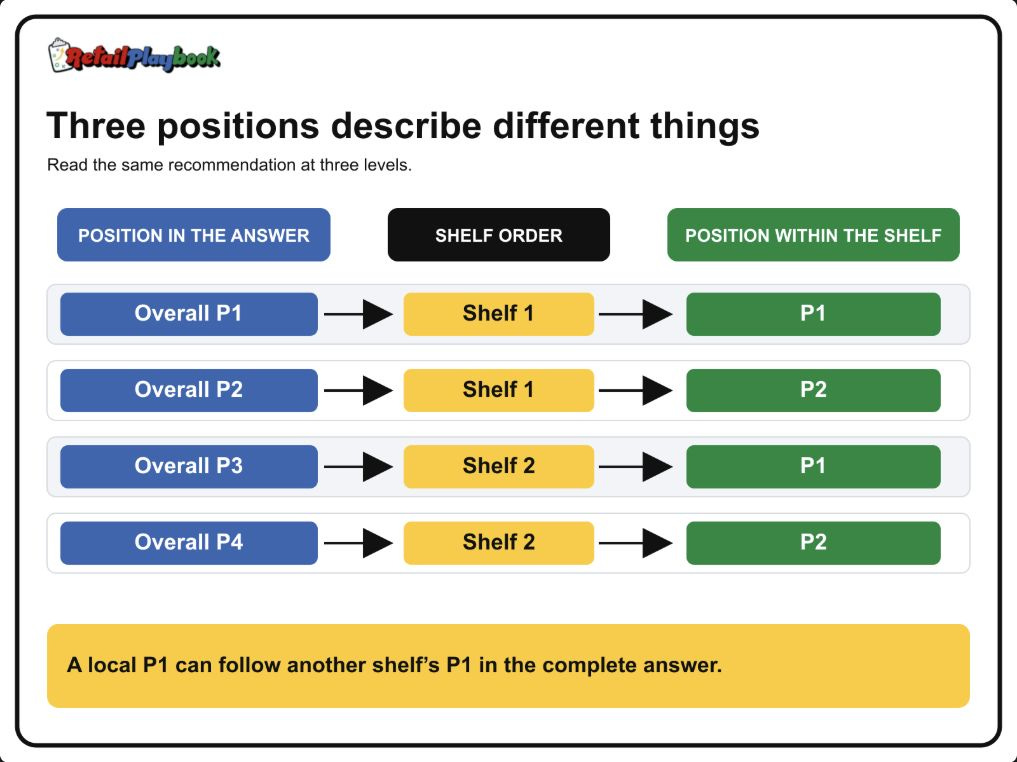
Figure 1. Answer position, shelf order and position within a shelf are separate coordinates.
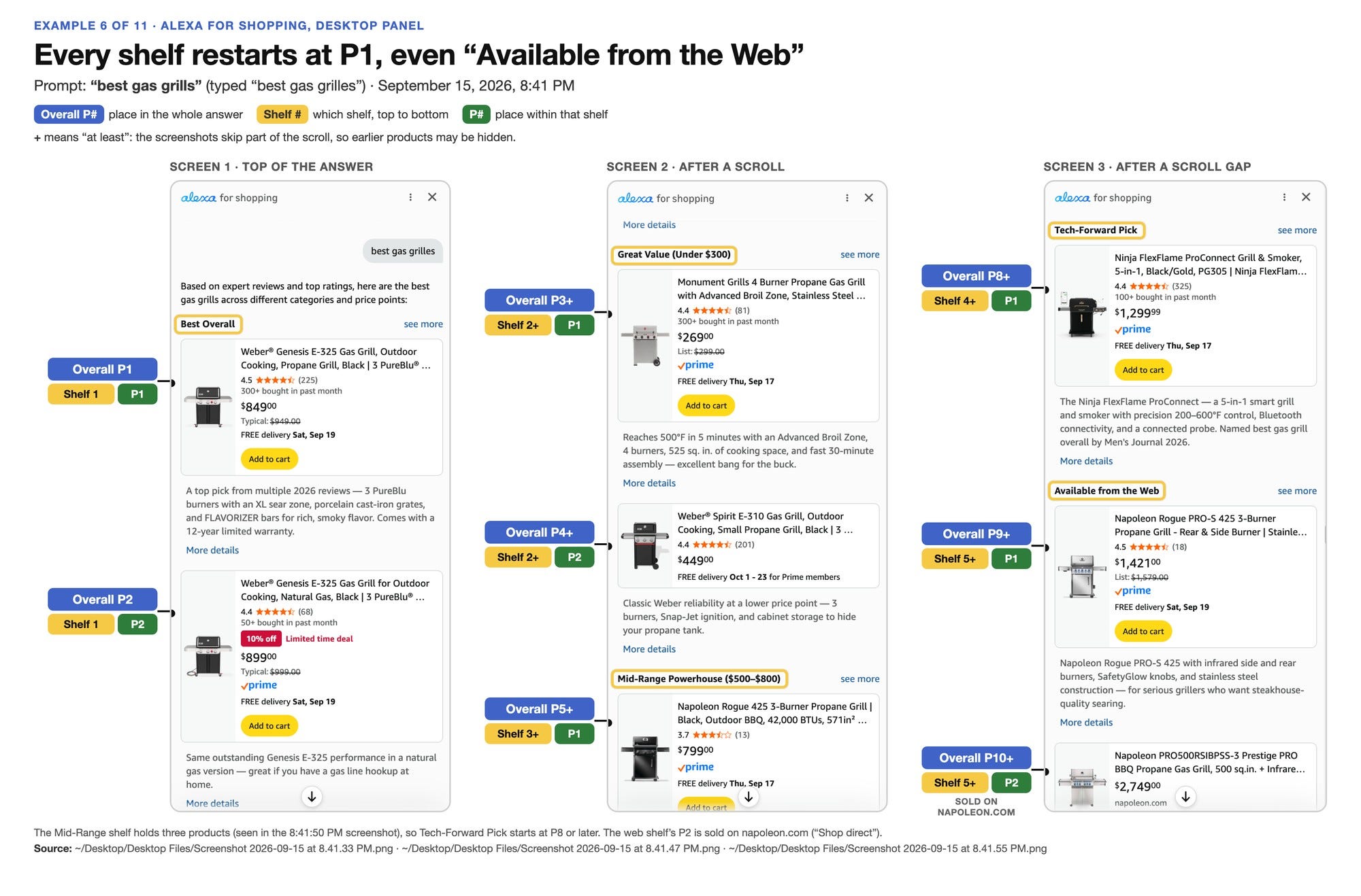
Shelf-position example. In this September 15 gas-grill capture, the Ninja FlexFlame leads the “Tech-Forward Pick” shelf but sits at overall P8 or later. The first product under “Available from the Web” also restarts at shelf P1, while appearing at overall P9 or later. The “+” signs mark minimum positions because the screenshots skip parts of the scroll.
A card may carry an explanation, explanations can draw on cited pages, and those pages describe product facts a brand can check against its own listing. A diagnosis can break at four points:
Shelf leadership read as answer leadership. A product leading the third shelf has local prominence but occupies a different place in the answer from the product leading the first.
Pooled medians read as targets. A category median cannot explain why one product appeared lower in one comparison.
Citations read as endorsements. A cited page may give the same model a different label or mention it only in passing.
Component facts attached to the whole product. A dishwasher-safe container with a top-rack lid has two care conditions, not one.
The pellet-grill captures supply a complete profile. In the later capture, Traeger Woodridge Pro was overall P1. That placed it first in the first semantic shelf, “Best Overall / Premium Pick,” and therefore at P1 within that shelf. The card showed $1,149.99, 4.4 stars with a displayed review count of 217, “100+ bought in past month” and a Prime badge, and the answer cited Taste of Home, whose captured page labeled the same model “Best for Beginners.” Every coordinate of the profile is visible in one answer, along with the shelf label, the offer and the cited evidence.
Two details make the example useful beyond grills. Its displayed review count of 217 sits far below every category’s overall-P1 median in the benchmark. The grill falls outside that benchmark population, but the contrast shows why the medians describe what appeared rather than a bar a product must clear. In the earlier capture, Traeger Woodridge, a separate model name in the same product line, sat second overall behind Traeger Westwood. Two names that differ by one word belong to two products, each with its own profile, which is why I record the profile for the exact model and offer.
Position benchmarks depend on the category and the semantic shelf
We calculated the benchmarks from the September 29 four-category desktop release. Every central value is a median, including reviews, displayed offer prices and star ratings.
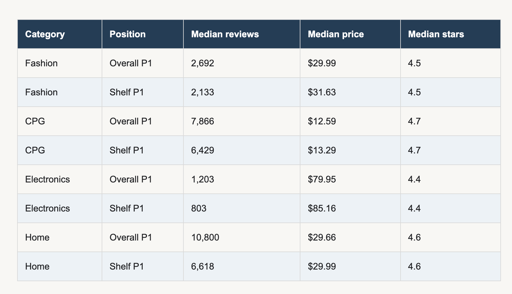
Overall P1 looks different by category. Median reviews range from 1,203 in Electronics to 10,800 in the observed Home sample, while median prices run from $12.59 in CPG to $79.95 in Electronics and ratings run from 4.4 to 4.7 stars. Home covers Kitchen & Dining and Bedding. Electronics and Home captures are incomplete, so those comparisons stay within the observed scope.
Review counts generally thin out deeper in the answer. Fashion falls from a median 2,692 at P1 to 1,420 at P10, Electronics from 1,203 to 312, and CPG from 7,866 to 4,000. The path is uneven, and each later position draws only from answers long enough to reach it.
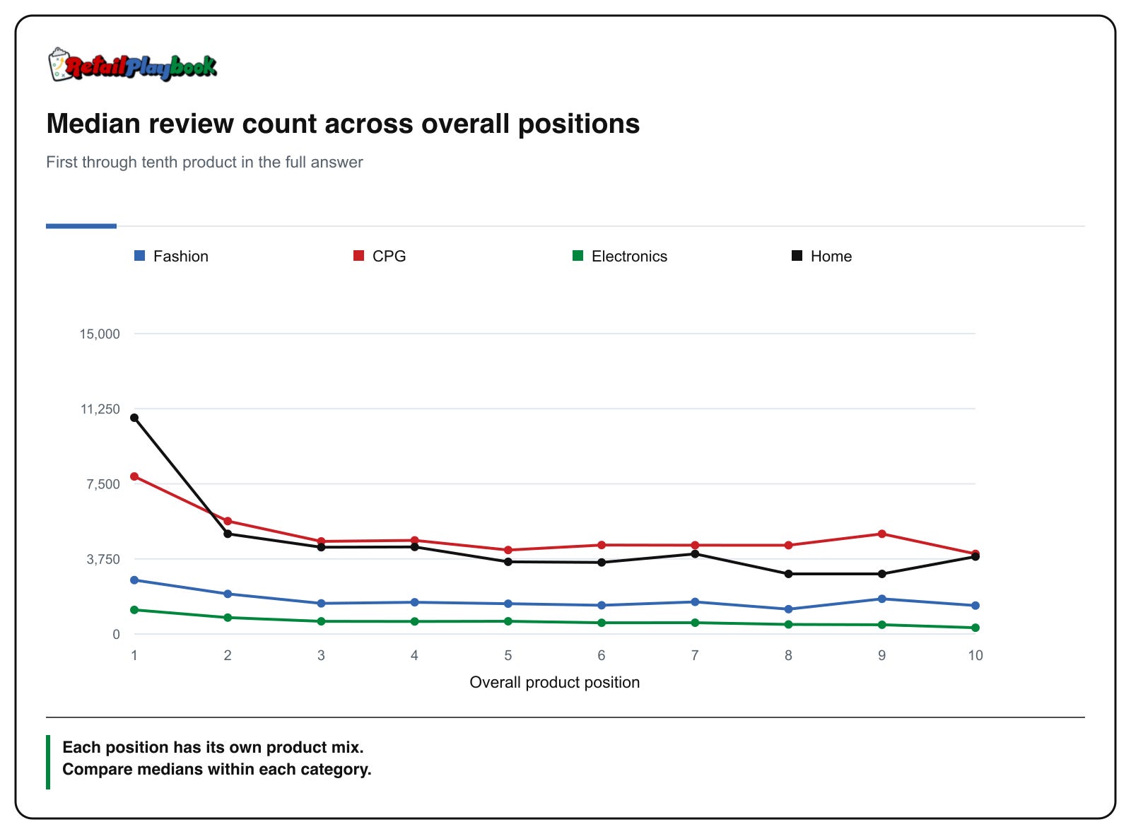
Figure 2. Median displayed review counts by category and overall position. Later positions occur only in longer answers, so the contributing answer population changes.
Ratings move less than review counts. Electronics holds a 4.4-star median from P1 through P10, and Fashion moves from 4.5 at P1 and P2 to 4.4 afterward. Similar ratings can accompany very different review counts, which echoes the overlapping Fashion star ratings in Part 1. Both measures belong in the comparison, and neither stands in for the other.
One Amazon research paper gives useful context. Building a Production Shopping Agent at Scale lists “low ratings (below 4.0 stars)” among recommendation defects and uses a “rating threshold ≥4.0” in its automated evaluation criteria. The paper shows what its researchers evaluated. A universal live-placement cutoff is a separate claim, and the paper does not establish it.1
Price behaves differently by category. Electronics rises from a median $79.95 at overall P1 to $158.00 at P10, Fashion stays close to $30, and CPG moves from $12.59 to $14.58. These are displayed offer prices without pack or capacity normalization, so I compare what the shopper receives before drawing any price conclusion.
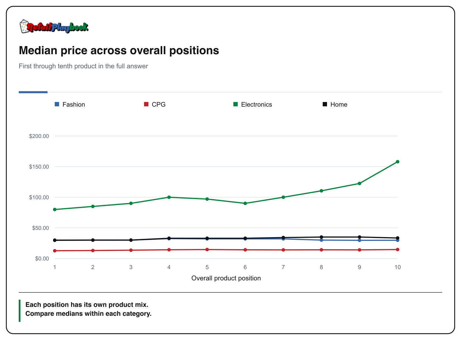
Figure 3. Median displayed offer prices in US dollars, without unit or pack normalization. These are descriptive profiles, not a price-change experiment.
For an Electronics brand, $79.95 is context for the captured category. The useful comparison is with products that meet the same requirement, including specifications, included components and offer conditions. Part 1 found a close-to-neutral adjusted association between price and placement, and the pooled P1 median cannot explain why a particular product appeared lower. Moving price toward that median could erase a legitimate product difference without addressing the product’s actual position in its comparison set.
Shelf order adds another distinction. The Electronics table separates the leaders of the first three shelves instead of counting every local first position as equivalent.
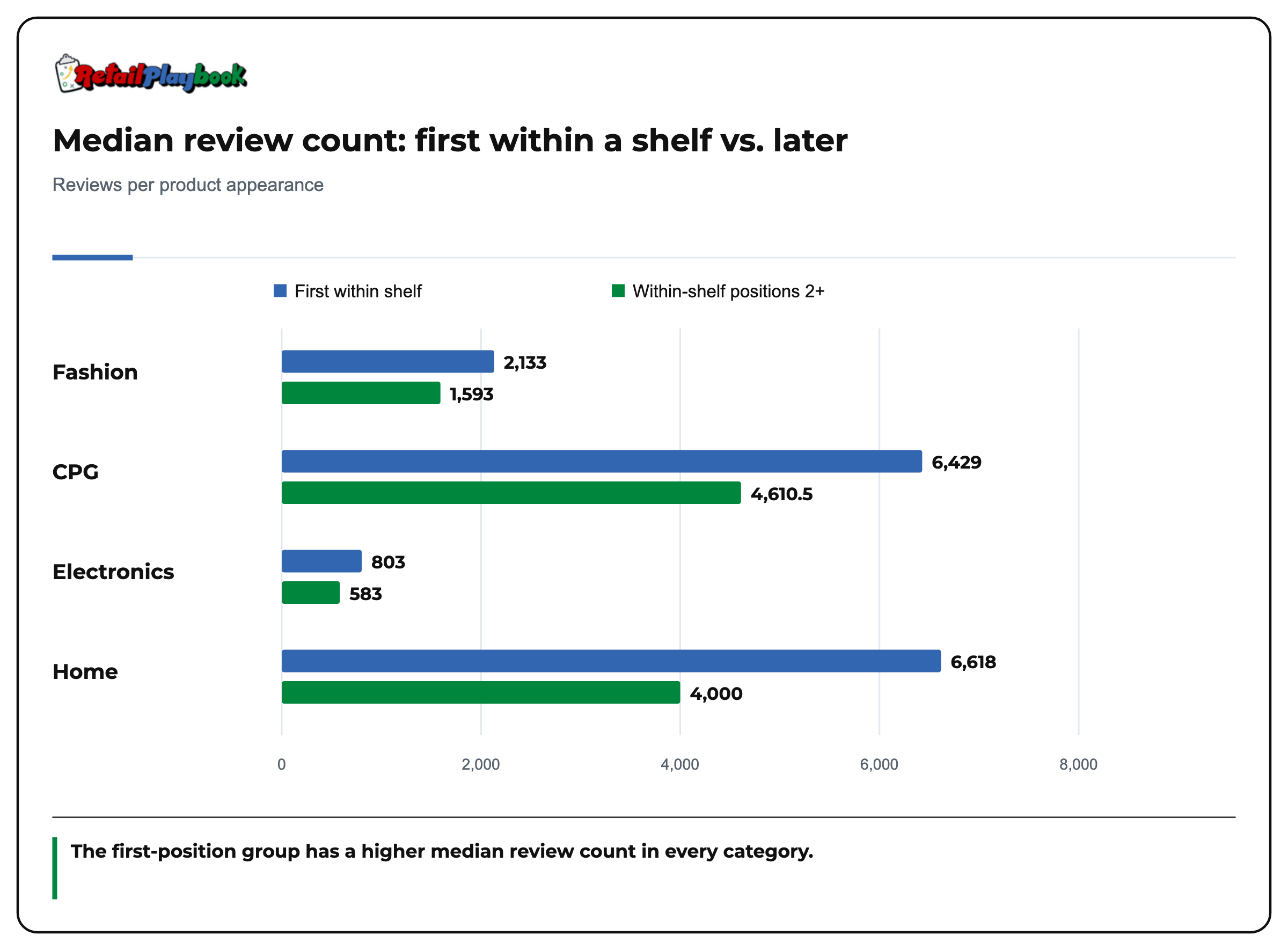
Figure 4. P1 products compared with later products in reconstructed semantic shelves. Larger groups contribute more later-position observations.
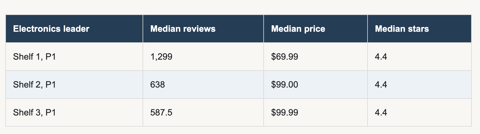
Across the leaders of the first three Electronics shelves, the median rating stays at 4.4 while median reviews decline from 1,299 to 587.5 and median price rises from $69.99 to $99.99. A brand reading its own Position Profile should report overall position, shelf order and position within the shelf together.
Readers will ask whether the top result had a deal, coupon, Prime badge or sponsored placement. The workbook records deal wording, reference price, positive numeric discount and monthly purchase signal as separate fields. At pooled overall P1, those rates were 16.2%, 38.0%, 16.1% and 59.4%. By P10, they had fallen to 2.3%, 7.3%, 2.3% and 14.6%. A reference price suggests a crossed-out price but does not confirm one was visible. Coupon and Prime fields are false throughout the extract, and sponsored status was not recorded. Appendix E breaks these measures down by category and position.
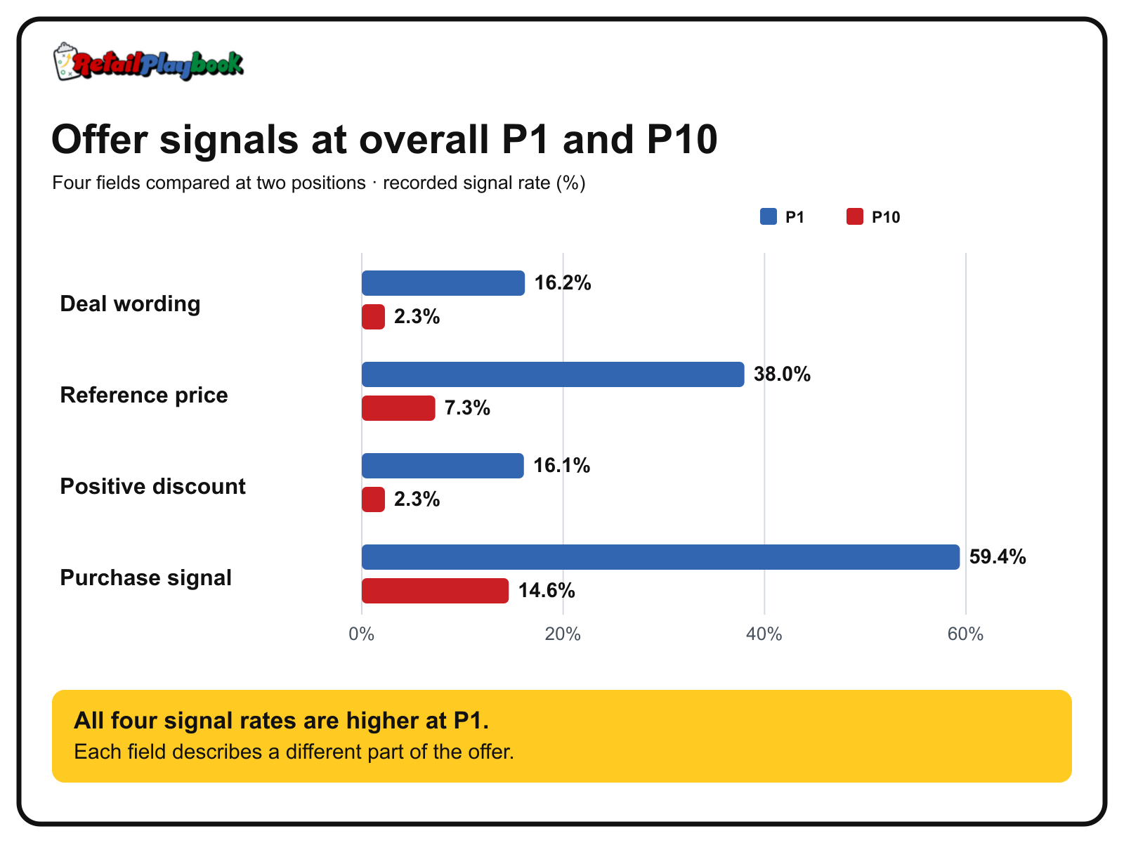
Figure 5. Recorded rates for deal wording, reference-price presence, positive discount and purchase signal at pooled overall P1 and P10.
Cited coverage is part of the product evidence
The leading domains differ by category. Forbes appeared in 9.4% of completed valid Fashion answers, Accio in 8.8% of CPG answers, TechRadar in 6.1% of Electronics answers and Good Housekeeping in 4.2% of Home answers. These percentages count answers containing the domain among the first five recorded source positions. Named-source labels are a separate view.
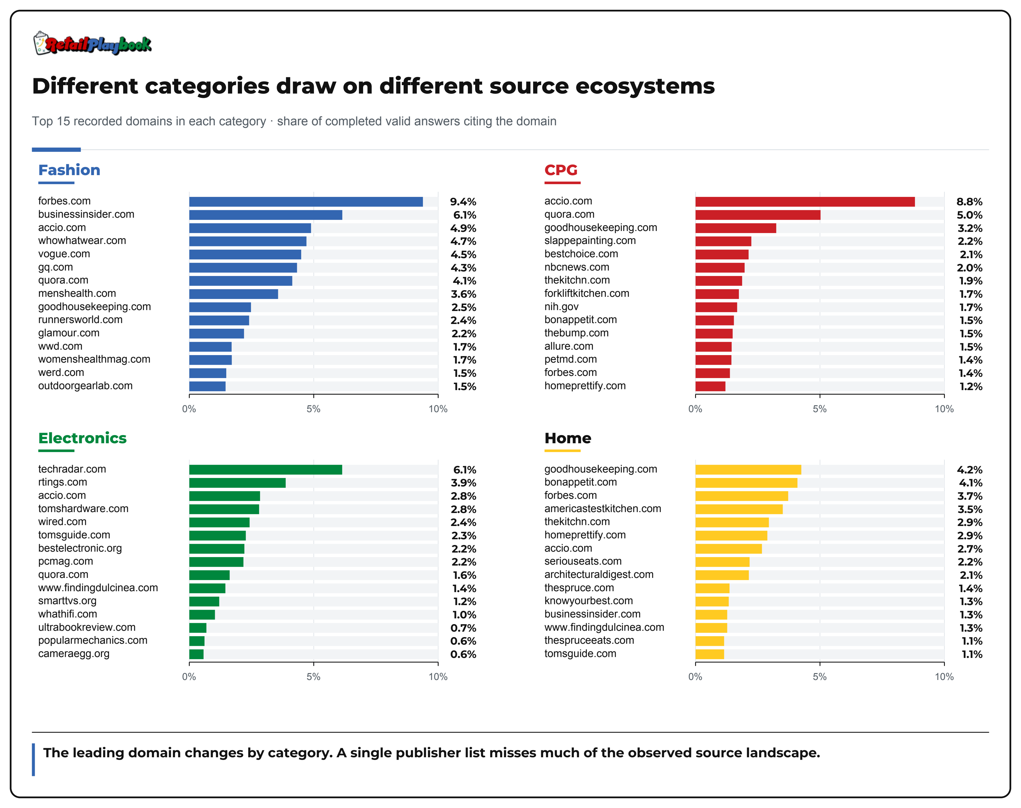
Figure 6. Domain reach across completed valid answers, using recorded source positions 1–5.
I open the cited page and check what it says about the exact product. A “Best for Beginners” recommendation, a performance comparison and a passing brand mention tell a brand different things, and they are not interchangeable evidence.
Amazon’s Language Model Alignment for Conversational Shopping at Amazon includes “relevance to the original query and aspect, brand reputation, customer ratings, and expert endorsements” in its assessment of a good recommendation. I read that as a reason to inspect what an endorsement says about the product and whether it fits the request. The paper does not say that a publisher receives a ranking weight, or that every citation is an endorsement.2
The pellet-grill captures make the question concrete. Alexa cited Taste of Home while recommending Traeger Woodridge Pro under “Best Overall / Premium Pick.” Taste of Home’s captured page called that same model “Best for Beginners.” The model matched. The label did not.
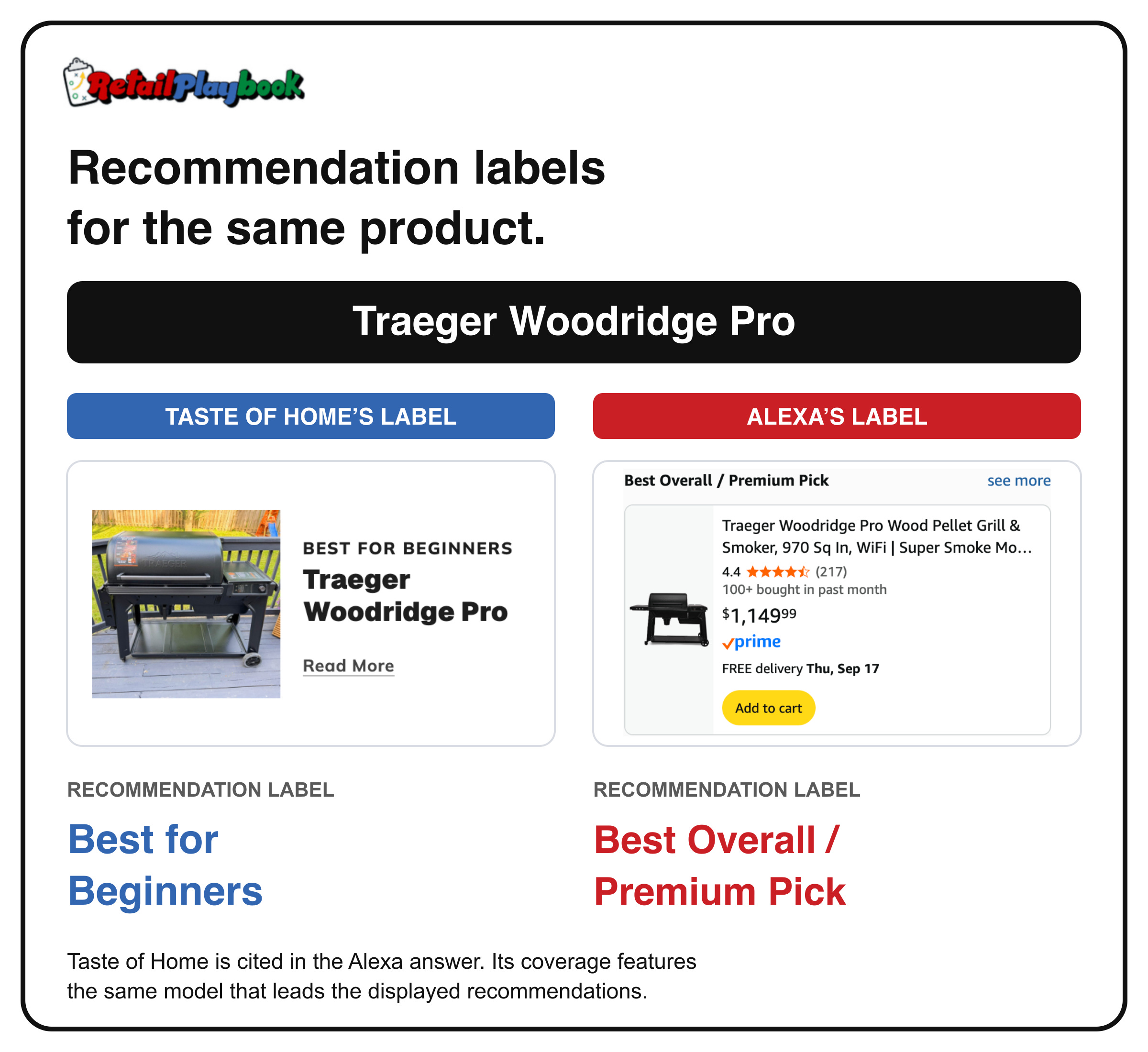
Figure 7. September 15 captures of Traeger Woodridge Pro. Different wording does not establish sole-source attribution or a causal change in recommendation.
Both halves of that observation matter to the brand. Coverage of the exact model is a discovery signal worth keeping, although one capture cannot show that the article caused the placement. The label difference is an accuracy question: the brand can compare the model, task and test conditions on the publisher’s page with its own product documentation, then ask whether the coverage supports the request Alexa answered. Appendix B expands the comparison.
The same capture carries the example to the product page. On the Woodridge Pro card, the title already states 970 square inches and WiFi, the kind of specification a premium comparison weighs. The publisher’s beginner framing raises a different question: whether the listing documents setup and everyday controls clearly enough for a first-time owner. A brand can answer both in the title, bullets, images and A+ content.
Category-specific citations and generative engine optimization (GEO)
For GEO, the source map separates into two layers: domains that recur across categories and the leading domain within each category. Accio appears in all four recorded top-15 lists, and Quora appears in Fashion, CPG and Electronics. Each category also has its own leader. Quora’s absence from the Home top 15 shows only that it was not among that category’s leading 15 domains.
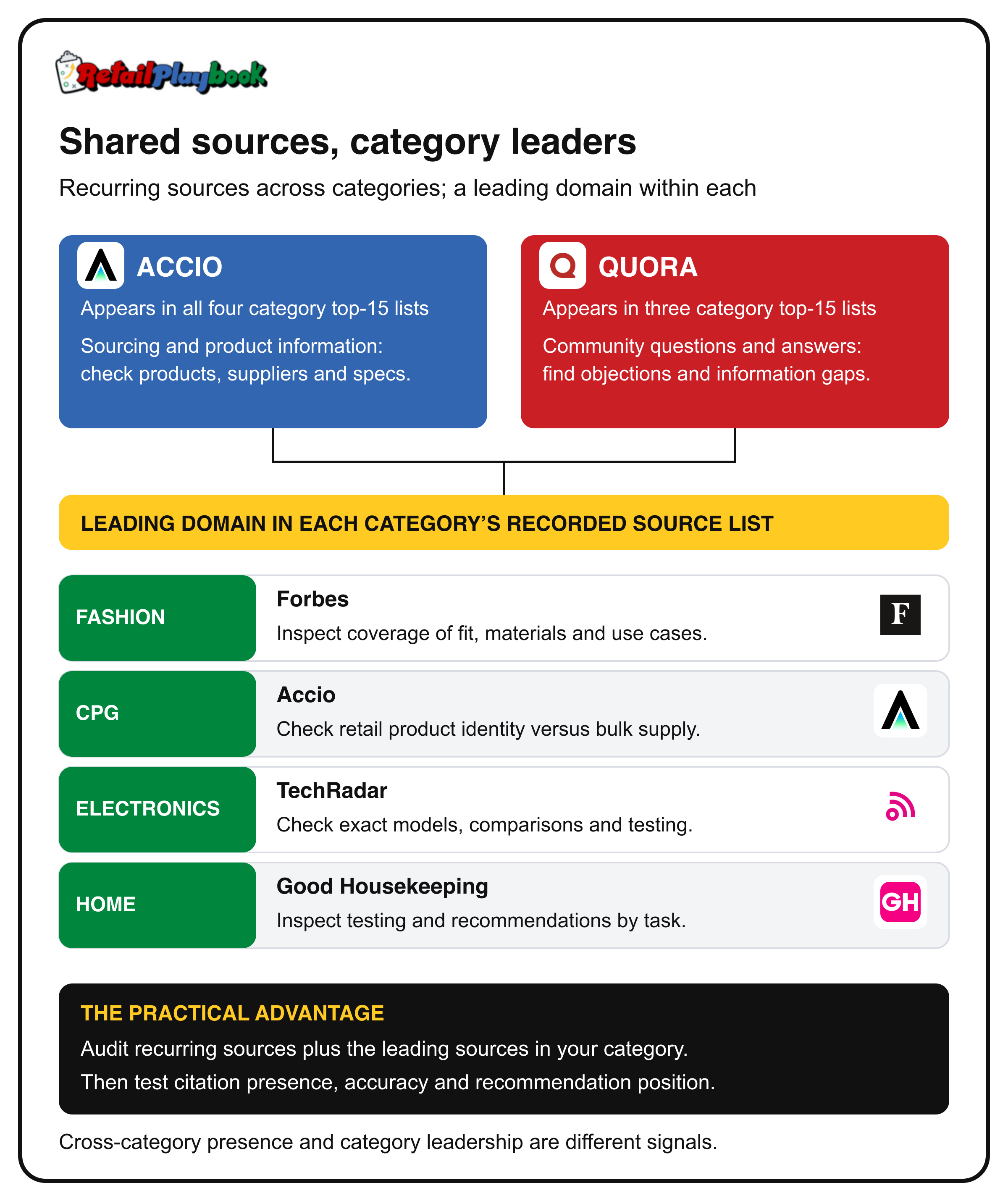
Figure 8. Recurring sources and category leaders give two starting points for a category-specific GEO review. Leaders refer to the recorded domain lists, and suggested actions are not measured ranking effects.
Accio and the Alibaba sourcing question
Accio’s reach is strongest in CPG at 8.8% of completed valid answers, compared with 4.9% in Fashion, 2.8% in Electronics and 2.7% in Home. Its guide describes artificial intelligence (AI) sourcing tied to Alibaba.com’s supplier network, and a published workflow example shows Accio Work generating product titles, copy, images and publishing materials. Those are relevant business signals. The workflow page is not evidence that any cited Accio article was produced by that agent.3 I therefore inspect Accio page by page, starting with the page itself: the product it describes, the evidence it gives, and how that evidence compares with Accio’s description of its tools.
Whether a product belongs on Alibaba is a separate decision, and an Accio citation alone is insufficient grounds for it. The evidence would need to connect the Alibaba listing to discovery by Accio, accurate representation of the exact product on an Accio page, and use of that page in an AFS answer.
For a brand already serving wholesale buyers, Alibaba is a commercial channel to evaluate on its own terms. The listing should identify the actual supplier relationship, model, specifications, order quantities and offer conditions. For the GEO investigation, I first determine whether the cited Accio page discusses the branded retail item, a generic product type, an original equipment manufacturer (OEM) alternative or another supplier’s product.
Quora and community questions
Quora appears in 5.0% of completed valid CPG answers and 4.1% of Fashion answers. I think of it as the Reddit-like source in this mix, where shoppers ask questions and share answers. Those discussions show how shoppers describe a problem and which questions remain unanswered.
A brand can feed those threads into its question inventory for bullets, Q&A and support pages. If a knowledgeable representative contributes, the answer should disclose the relationship and support its product claims. Whether participation changes AFS visibility remains a question for testing, separate from the value of correcting inaccurate information.
Category-specific priorities
The category priorities extend what Part 1 found in product explanations, which leaned on features and functions in Electronics, on size and pack value in CPG, and on materials and fit in Fashion. The recorded publishers in each category suggest where to check those details first:
Fashion: Forbes leads the recorded domain list, with Business Insider, Who What Wear, Vogue and GQ also present. I check how cited coverage describes sizing, fit, materials, care and intended use, and keep each description attached to the exact item.
CPG: Accio and Quora lead the recorded list, with Good Housekeeping, The Kitchn and Bon Appétit also present. I distinguish branded retail products from bulk supply, then check ingredients, pack sizes, preparation and use conditions. A supplier’s description of one formulation should not become a claim about another.
Electronics: TechRadar leads, with sources including RTINGS and Tom’s Hardware. I verify exact models, generations, compatibility and test conditions, because a favorable verdict for one version does not substantiate the same claim for a later model or cheaper configuration.
Home: Good Housekeeping leads the observed Kitchen & Dining and Bedding sample, with Bon Appétit, America’s Test Kitchen and The Kitchn also present. Dimensions, capacity, materials, care and the recommended task frame the audit questions.
Testing the opportunity
For each selected prompt, I retain the cited URL, the relevant passage, the product identity, the recommendation label and the displayed position. I classify a page as original testing, supplier information, editorial synthesis, community experience or disclosed AI-generated material only where page-level evidence supports it, since a single page can combine several of these.
After correcting a documented gap, I check that the source page changed and allow for retrieval or indexing delay before repeating the requests. I track citation presence, factual accuracy, product inclusion and position separately, using unchanged products or prompts for comparison where feasible. A single changed answer would not show improved recommendation performance.
Turn the findings into product-page work
The Position Profile chooses the comparison group, and the cited page shows what others say about the product. The work then returns to the exact offer: which fact is accurate, which fact belongs to the right product or component, and which shopper question the page still leaves open. Two practices I cover in their own pieces apply here. Attribute Optimization checks whether each structured fact is accurate, attached to the right product or component, and consistent with the selected offer. Product Page Coverage asks whether the page answers the shopper’s actual questions, constraints and objections. Accurate attributes can still leave an important question unanswered, which is why the two work together.
Consider the Pyrex Simply Store 3-cup rectangular glass container with a red lid, manufacturer SKU 1075430. Its published care instructions support the wording “Dishwasher-safe glass container. Wash the plastic lid on the top rack.” For a selected offer that matches this model, that component-specific condition belongs in the structured attributes, the care bullet, a product image and the A+ content.4
A shopper carrying soup in a bag needs more than a “secure lid” description. The page needs evidence of leak resistance, and the product or quality team should substantiate that condition before it appears anywhere on the listing. I then repeat the same questions to see whether Alexa describes care and product fit accurately.
Each finding in this study points to a specific part of the listing:
Review depth thins out by position while ratings stay flat. Reviews: read the reasons buyers give alongside the count, and treat recurring complaints as product or expectation problems that copy cannot repair.
Electronics price rises with position. Title and attributes: state the exact model, generation and included components so the comparison set is clear.
A cited page describes a different version or label. Variations: keep variant-specific facts inside the correct variation family, and correct conflicting details where the brand controls them.
Follow-up questions and Quora threads. Q&A and bullets: answer the questions shoppers actually raise.
Component-specific care, such as the Pyrex lid. Attributes, the care bullet, a product image and A+ content.
Model-level coverage, such as Traeger Woodridge Pro. Title and attributes: keep the model name consistent with the product documentation so coverage can be matched to the right product.
What the findings mean for brands
Read together, the position benchmarks describe answers whose top is marked by accumulated buyer evidence. Median review counts thin out deeper in the answer, and the monthly purchase signal falls from 59.4% of overall-P1 cards to 14.6% of P10 cards, while median ratings barely move and Part 1 found price close to neutral after adjustment. None of that discloses how Alexa ranks or proves that any single change would move a product. Reviews and purchase signals accumulate from buyers over time, so a brand’s practical work sits with the product and the page that describes it: the problems behind recurring complaints, the accuracy of every documented fact, and a price judged against products that meet the same requirement.
A single rank hides the difference between appearing in an answer, leading a shelf and leading the answer, which is why the Position Profile keeps all three coordinates. Reach and leadership need separate diagnoses too. A brand missing from relevant missions has a different problem from one that appears widely and rarely leads, and Appendix A shows both patterns in the brand data.
The evidence also extends beyond the listing. Each category has its own leading publishers, a citation can carry the right model under a different label, and sources a brand never pitched, from Accio pages to Quora threads, already appear among the citations in its category. A category-specific source map therefore belongs in the same audit as the product page, and precision connects the two: consistent model names let coverage attach to the right product, while component-level facts, such as the Pyrex lid’s top-rack care, belong in the attributes, bullets, images and A+ content of the matching offer.
Start with one exact offer and a fixed set of shopping missions:
Record the Position Profile. Log overall position, shelf order and position within the shelf, along with the displayed offer, any explanation beside the card and every cited page.
Open the cited pages. Note whether each one describes the exact model, which label it gives and what evidence supports the claim.
Check the product page. Confirm each documented fact sits on the right product, component and offer, and flag the shopper questions the page still leaves open.
Fix one documented gap, then repeat the same requests. Measure accuracy, inclusion and position separately, after allowing for retrieval or indexing delay.
Judge commercial success the way Part 1 recommended. Compare qualified visits, conversion, expectation-driven returns and contribution margin against a baseline set before the change.
No product fits every mission. A sound audit says where the product fits and where its documented limits matter, so the page helps the shopper decide without making an unsupported promise. The full analysis from this research program is at alexaforshopping.refibuy.ai.
Position is what Alexa shows. The page is what a brand controls. Prepare each product for the missions it can credibly serve, and its position becomes something the brand can explain rather than something it hopes for.
Appendix A: Brand reach and additional commercial context
A brand can appear across many requests while leading relatively few of the answers where it appears. Another can have narrower reach but lead more often within that smaller set. The graphic separates answer reach from first-position rate conditional on appearing, using selected high-confidence brand profiles.
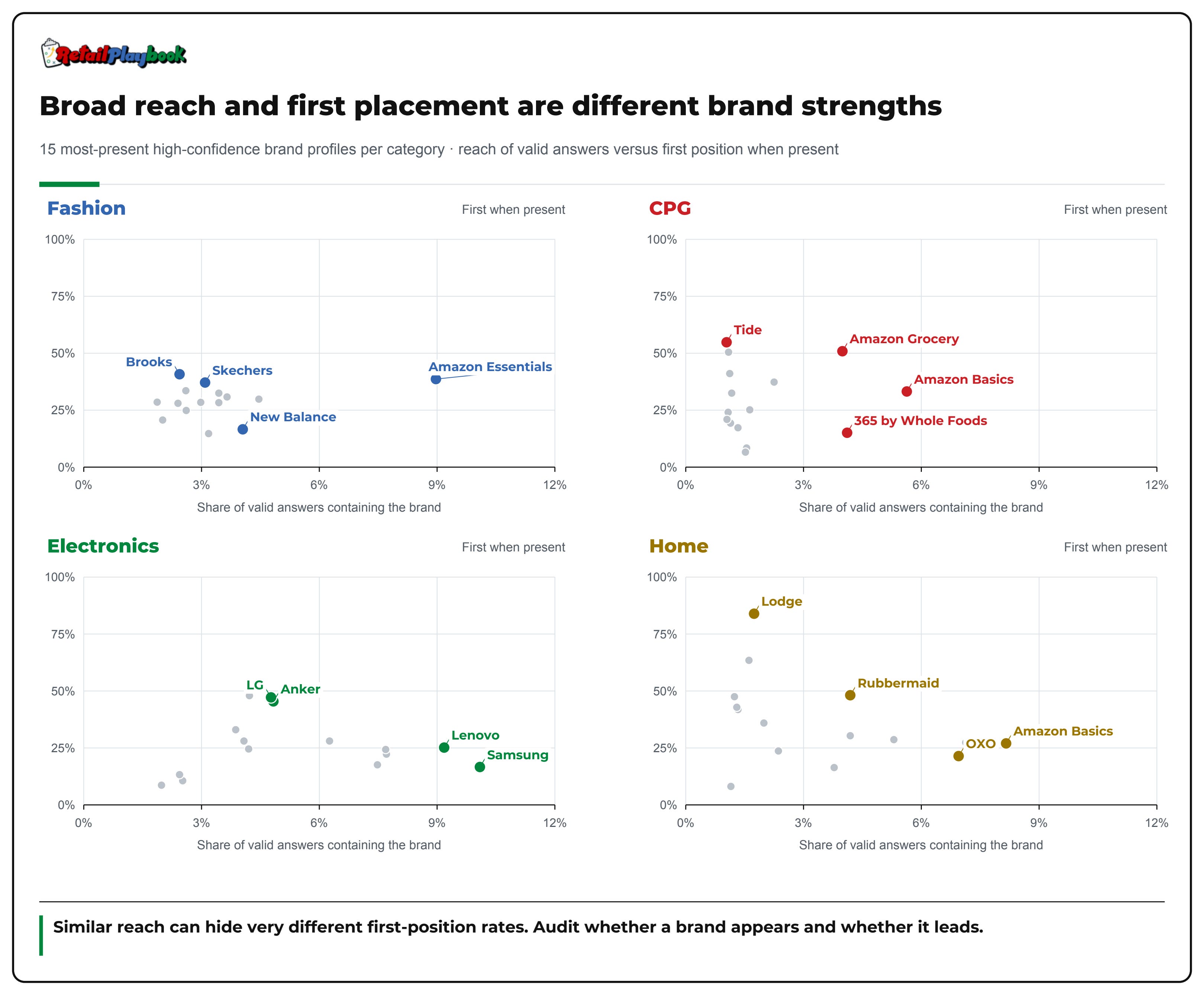
Figure 9. Share of valid answers containing each brand versus first-position rate conditional on appearing. Selected high-confidence brand profiles, not consumer market shares.
The Home panel places Lodge at lower reach but a higher first-position rate when present than several broader-reaching brands. For a brand with narrow reach, I look for relevant missions where it is absent. Where reach is broad but first placement is weaker, I compare its offers and product evidence with the alternatives in those same requests.
Purchase signals and discounts use available values separately. At Electronics overall P1, the median recorded monthly purchase signal is 1,000, while the median recorded discount is 23%. Missing values are not zeros, and displayed purchase signals may be rounded or thresholded rather than exact sales.
Appendix B: The full pellet-grill comparison
Both captured answers visibly cited Men’s Journal and Quality Grill Parts. The earlier answer also showed Bob Vila and led with Traeger Westwood, while the later showed Taste of Home and led with Traeger Woodridge Pro. The source strips were horizontally clipped, so the comparison covers the visible names.
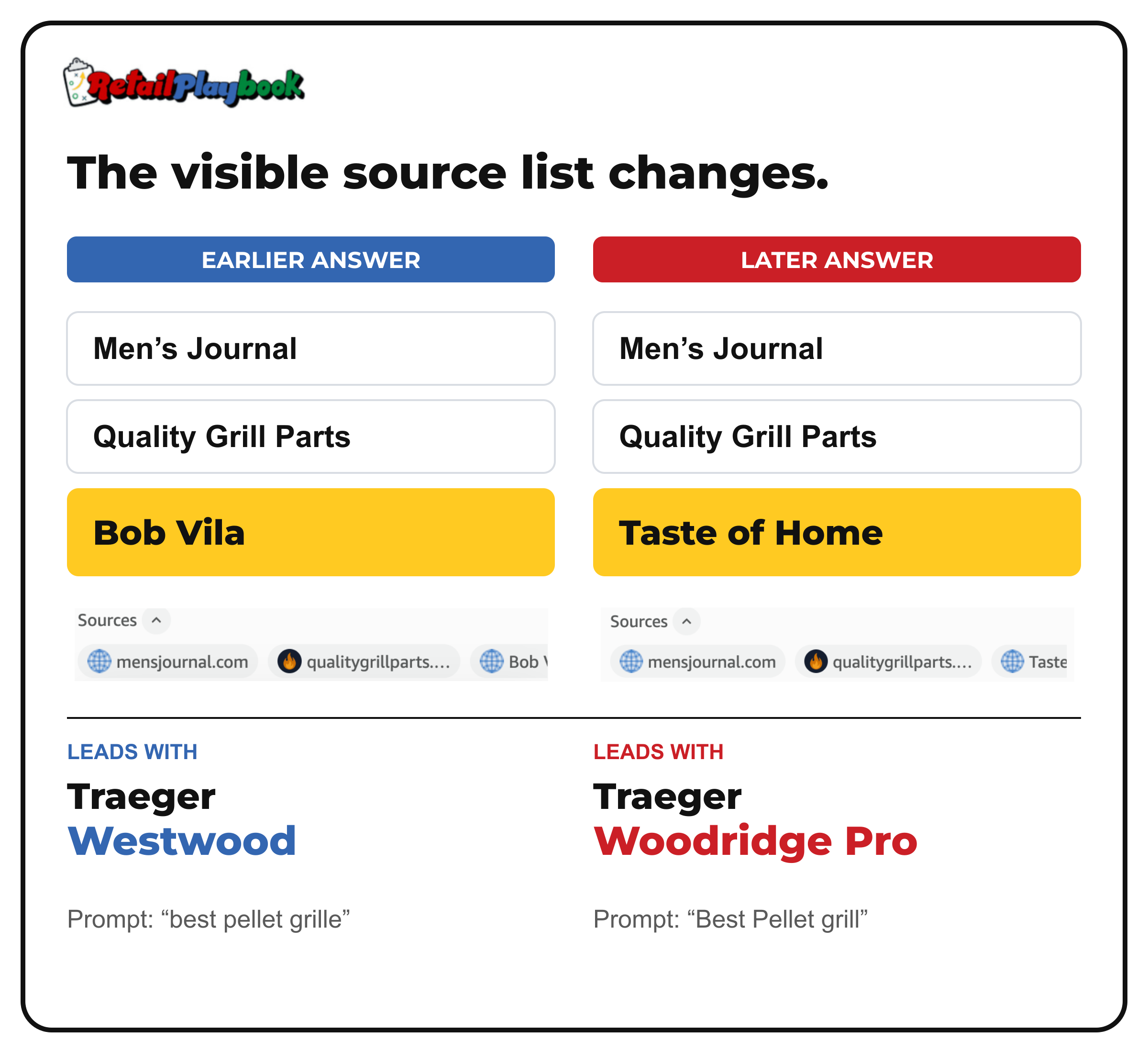
Figure 10. September 15 captures: visible source names and lead products differ. Source strips are clipped and prompts are not identical, so this is not a controlled attribution test.
Product order differed beyond the first card. Counting from top to bottom across the answer’s semantic shelves, recteq Flagship 1600 appeared fourth in the earlier capture and second in the later one. Pit Boss 850 Navigator appeared eighth and third, respectively.
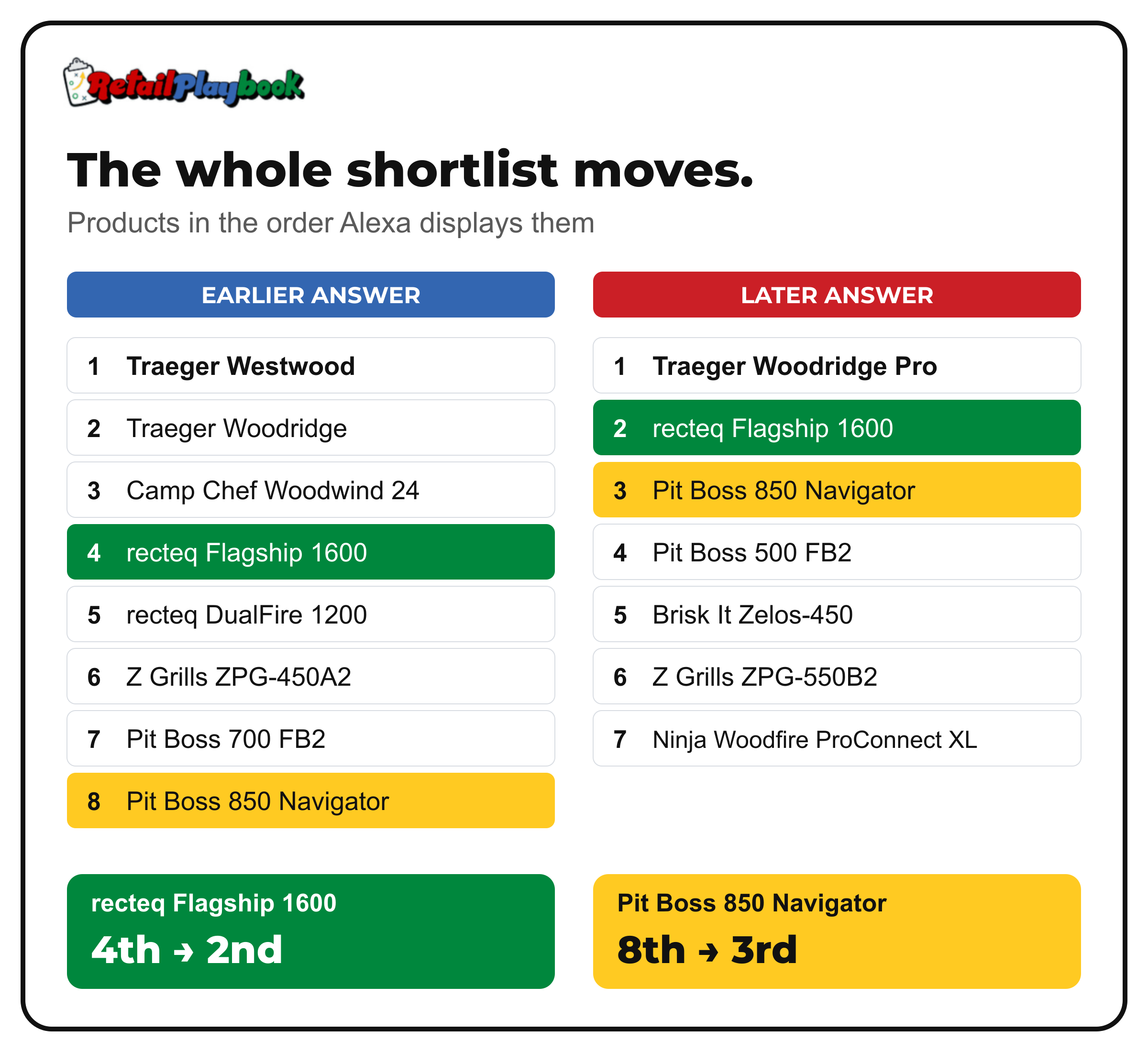
Figure 11. Display positions counted across answer sections. recteq Flagship 1600 appears fourth, then second. Pit Boss 850 Navigator appears eighth, then third. The captures do not isolate the cause.
The earlier prompt was “best pellet grille” and the later was “Best Pellet grill.” These were not controlled repeat trials, and session context, generation variability, availability or retrieval could have contributed to the differences. When I investigate a change, I preserve the complete answer, prompt, shelf headings and citations together.
Opened publisher pages also disagreed. Men’s Journal and Bob Vila’s visible award card favored Traeger Westwood as their overall pick, while Taste of Home and Quality Grill Parts favored Weber Searwood 600. Bob Vila’s body list referred to Westwood XL, a model-name inconsistency that remains unresolved.
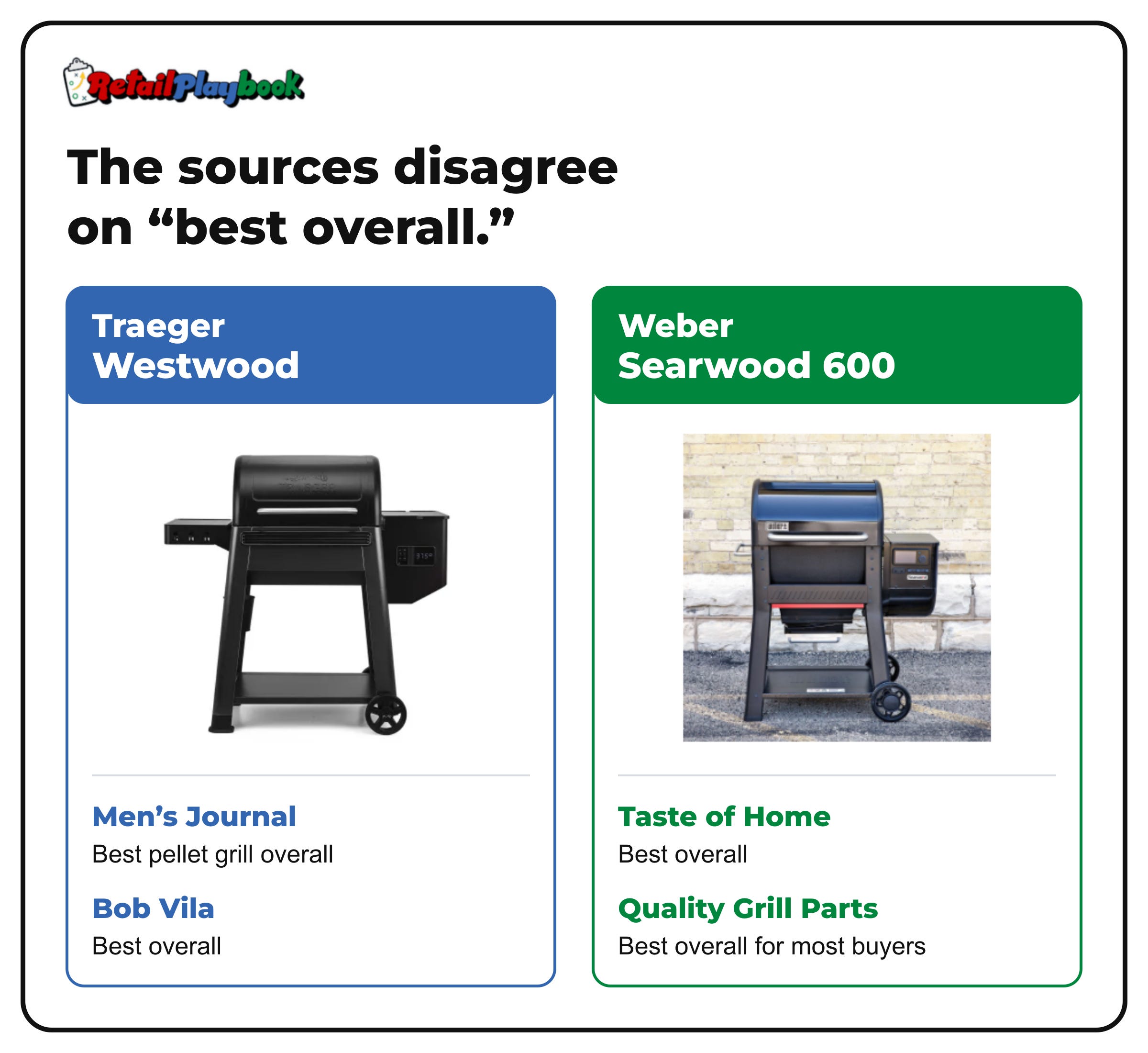
Figure 12. Overall-pick labels in the supplied publisher captures. Bob Vila’s award card names Westwood while its body list names Westwood XL.
The captured labels show why counting mentions alone misses useful context: an overall award, a beginner recommendation and a passing reference do different work. None of the grill observations enter the Home benchmark population used elsewhere in this article.
Appendix C: Source types
A separate site-trait review covered 64 recorded labels accounting for 32.9% of source–answer pairs in its ledger. A publisher could disclose affiliate commissions, publish editorial material and describe product testing at the same time. These overlapping traits help organize an audit, while the accuracy of a product claim still requires inspecting the particular page.
Appendix D: Study scope and interpretation
The 100K title refers to the broader research program behind both parts of this series. Its studies use distinct populations that may overlap, so their totals should not be added together as if each captured a separate set of shoppers. The September 29 benchmark covers valid completed answers from its authored prompt set, and the figures in this article are reported within that scope.
Repeated product appearances remain in the benchmark data, and reconstructed semantic shelves include some unheaded product lists. Overall P1 is measured across complete answers, while within-shelf positions come from reconstructed multi-product groups. Full tables report medians and recorded signal percentages across overall positions and positions within shelves.
Prices represent displayed offers in US dollars without unit, pack or capacity normalization. Electronics and Home capture was incomplete, their source notes disclose personalized interface language, and Home covers Kitchen & Dining and Bedding. Equal medians can conceal different distributions, and changing answer lengths change the population contributing to later positions.
Some of this article is inferred from Amazon’s published research, observable answer behavior and our own captures rather than from a disclosed production ranking document. The desktop captures show Alexa’s responses in this release. Amazon’s papers show what its researchers evaluate, but they do not disclose the full live ranking formula. I treat the product-page changes and GEO actions here as practices to test against fixed requests, and I measure their effects before drawing conclusions.
Appendix E: Complete profiles by overall and within-shelf position
These profile tables carry the overall and within-shelf comparisons through every observed position, with filters for Fashion, CPG, Electronics and Home. They add offer signals to median reviews, prices and ratings so each category can be compared.
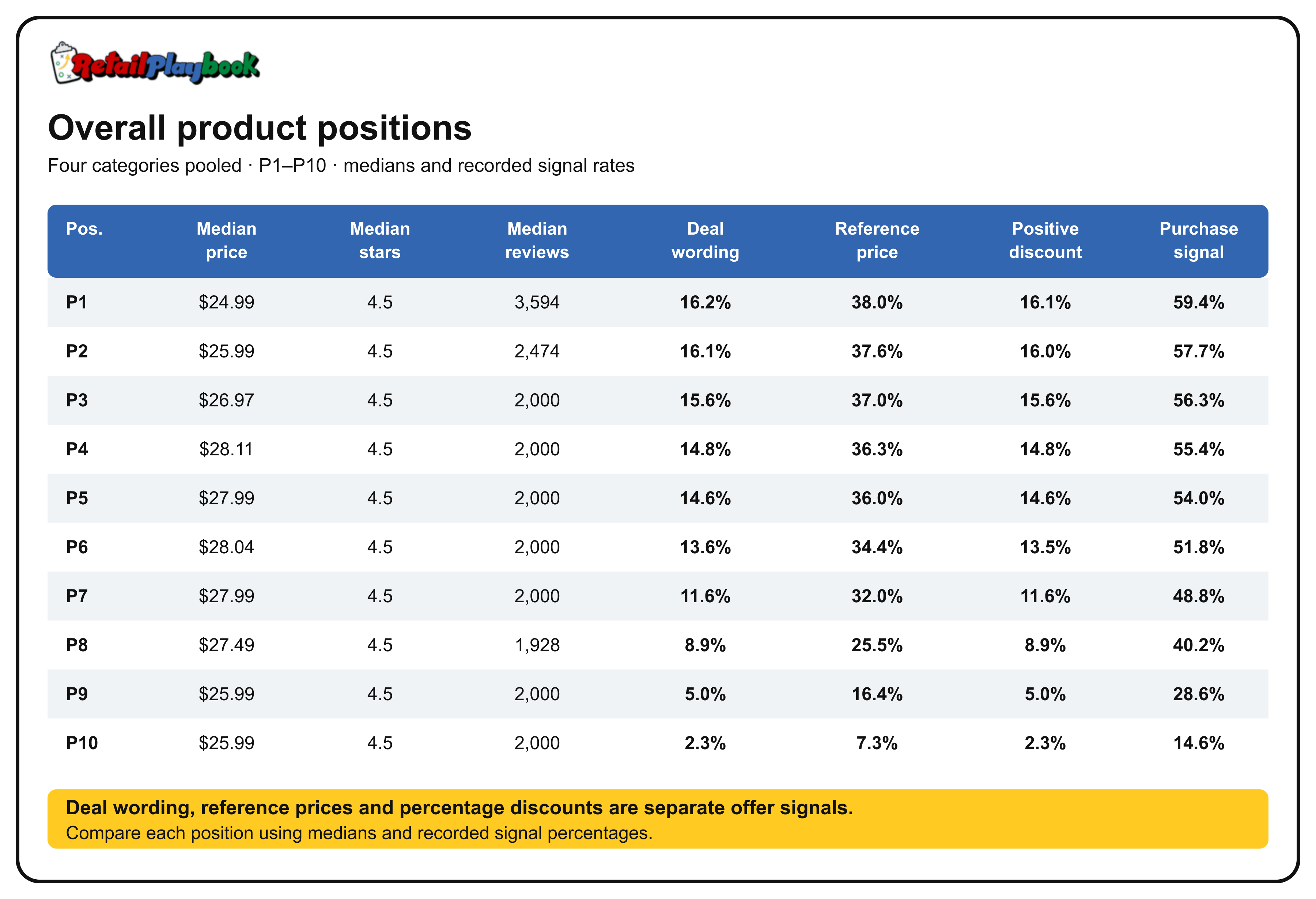
Figure 13. Overall product positions, four categories pooled, P1–P10. Medians use available values, and signal rates divide recorded values by all products at that position. Reference-price presence does not verify a visible strikethrough.
Deal wording, reference prices and numeric discounts are separate fields. Among recorded overall-P1 discounts, the median discount was 21%.
Within-shelf positions restart at P1 inside each reconstructed semantic shelf, so P1 and P2 draw from the same qualifying groups. Recorded deal wording appears on 16.9% of those P1 cards and 17.0% of P2 cards, while their median prices are both $26.99.
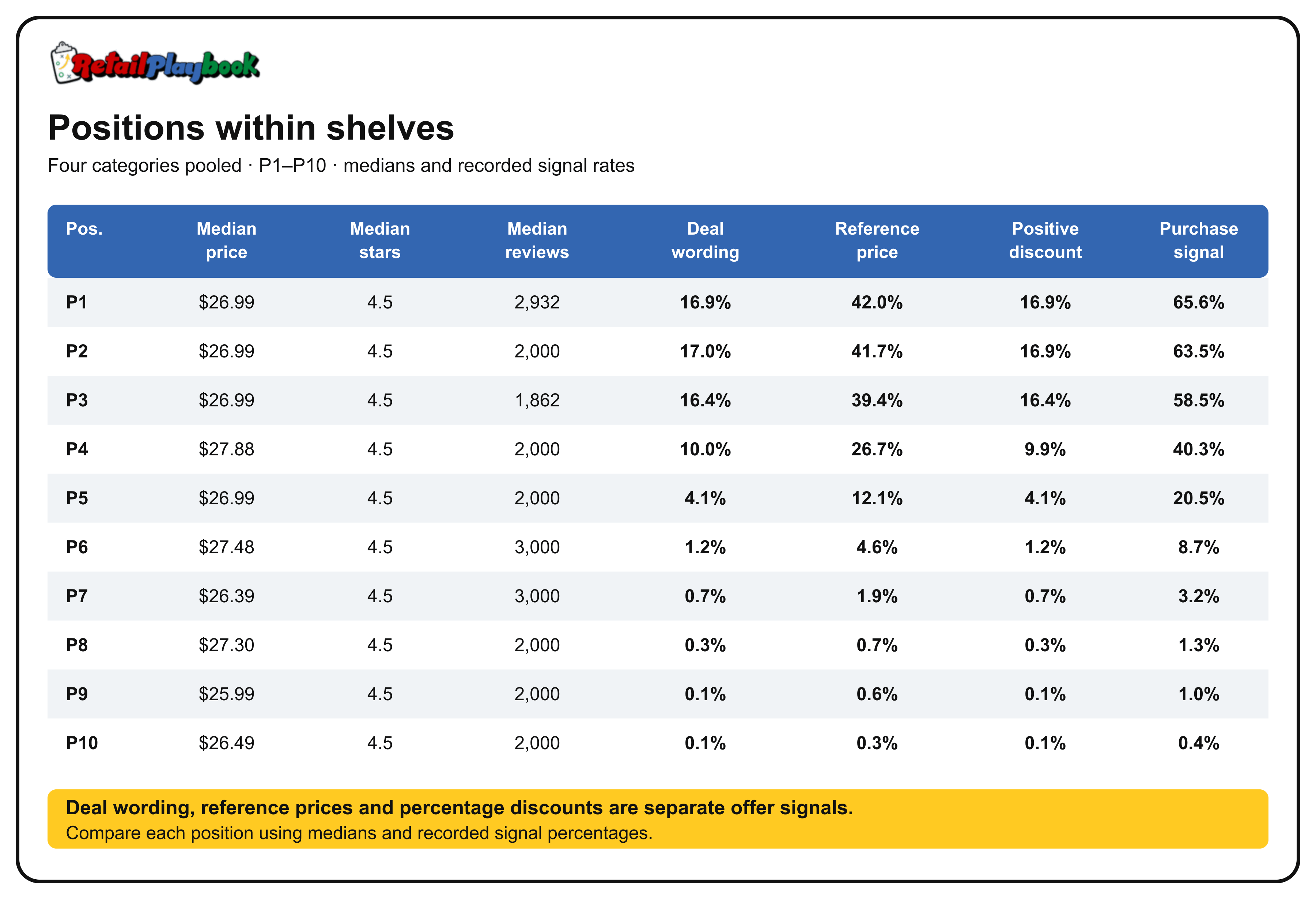
Figure 14. Positions within semantic shelves, four categories pooled, P1–P10. Within-shelf comparisons use reconstructed multi-product groups, and the full tables retain all observed positions and category filters.
The overview graphics show P1–P10, while the full tables preserve every observed position through P38. Later positions have fewer observations and a different category mix, so I check any pooled change within the relevant category before drawing a competitive conclusion. The filters also show medians for monthly purchase signals and discounts.
Some recorded fields cannot support the comparison readers might expect. Coupon and Prime flags are false throughout this extract, and sponsored status is unrecorded throughout. They remain visible in the supporting tables as data-quality limits, not as evidence that those features were absent from the shopping experience.
Appendix F: 18 consequential charts and annotated examples
These 18 visuals bring together annotated shopping examples and the study’s most useful comparisons of position, product explanations and cited sources. I selected them for the questions they help a brand answer, and grouped them by subject. The overall and within-shelf position-profile tables remain in Appendix E.
Each chart retains its own population and measurement method. Some values were reconstructed approximately from source figures, as labeled on the graphic. The findings describe observed outputs; they do not establish Amazon’s internal ranking rules or the effect of changing a listing.
F1. Read the shelf, card and rationale together
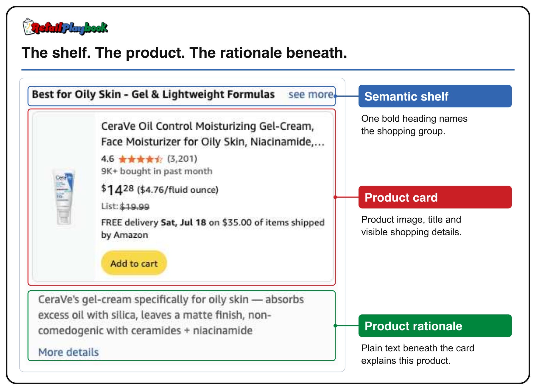
Figure F1. The annotated CeraVe example separates the semantic shelf, the product card and the explanation beneath it.
These three surfaces answer different questions: the shopping need, the displayed offer, and the reason given for the recommendation. Capture all three when reviewing an exact product.
F2. Start with the nearest competitors
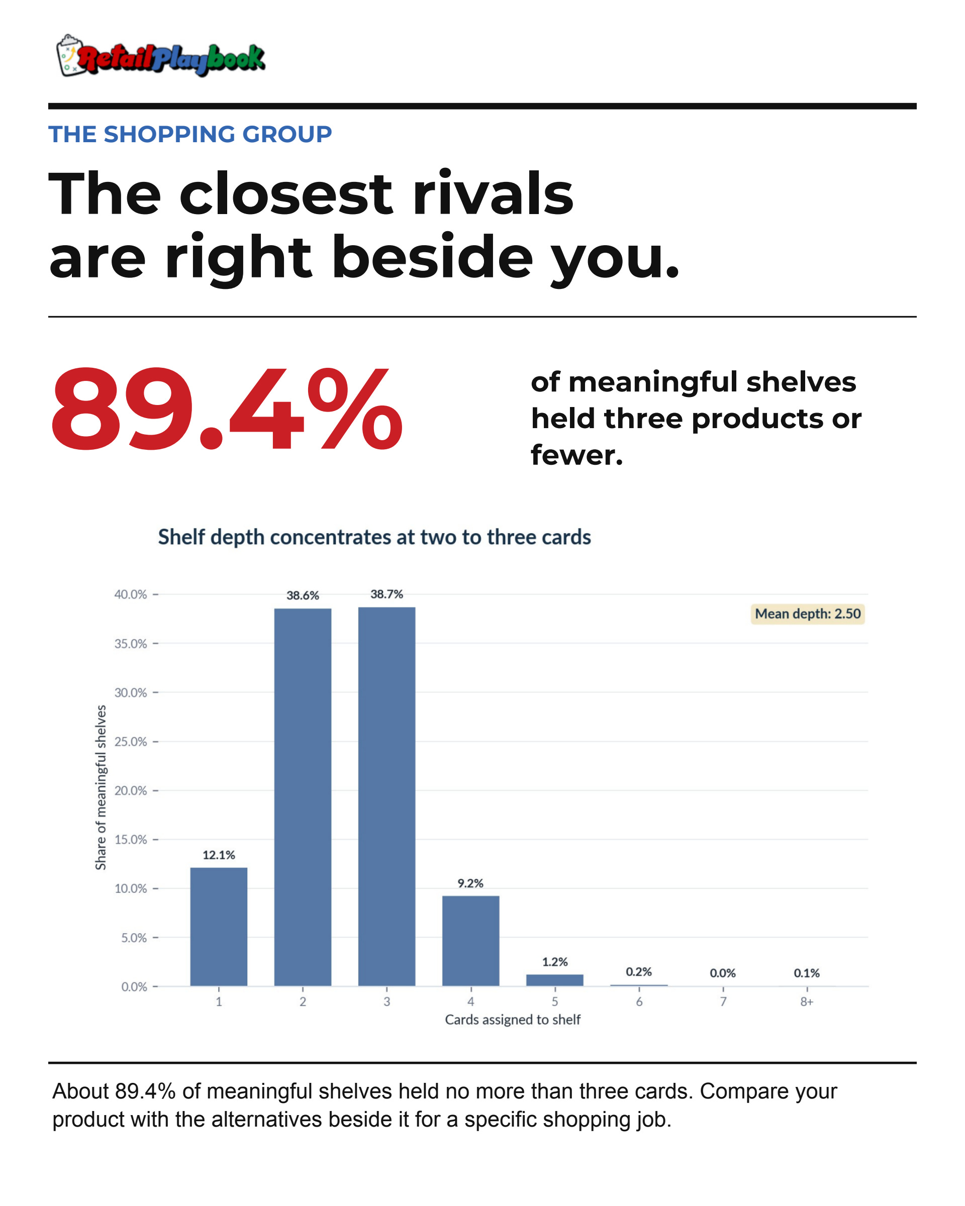
Figure F2. About 89.4% of 64,900 meaningful semantic shelves contained three products or fewer.
The practical comparison is often a small group serving one shopping job. Audit the alternatives beside your product before comparing it with the entire category.
F3. Underdog recommendations often explain a specific use
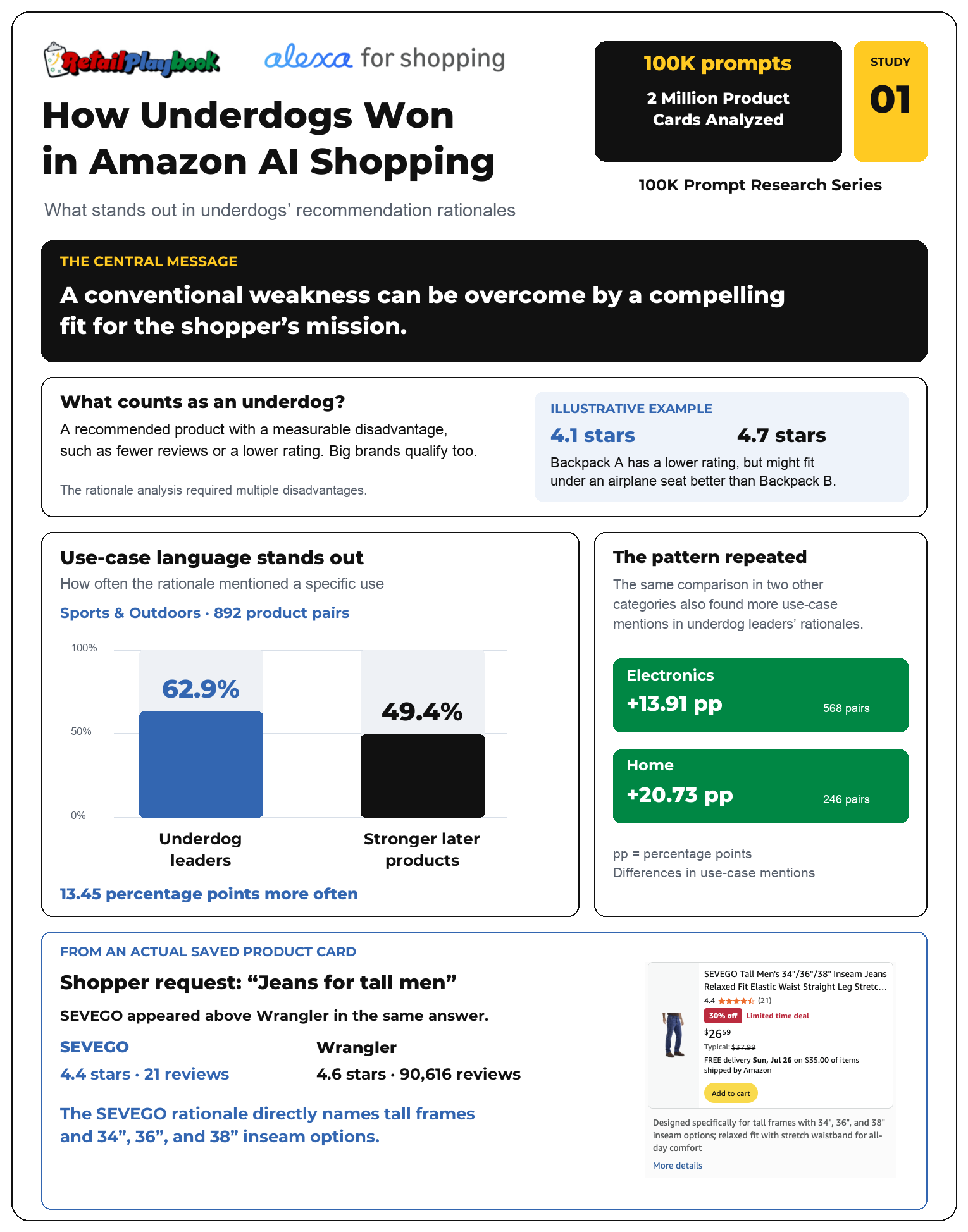
Figure F3. In the displayed Sports & Outdoors comparison, use-case language appeared in 62.9% of underdog leaders’ rationales versus 49.4% for stronger later products.
The saved jeans example shows why exact fit and inseam details can matter to the request. The comparison concerns observed rationale language; it does not prove that adding the same wording would cause a product to win.
F4. Functional specificity distinguishes different kinds of wins
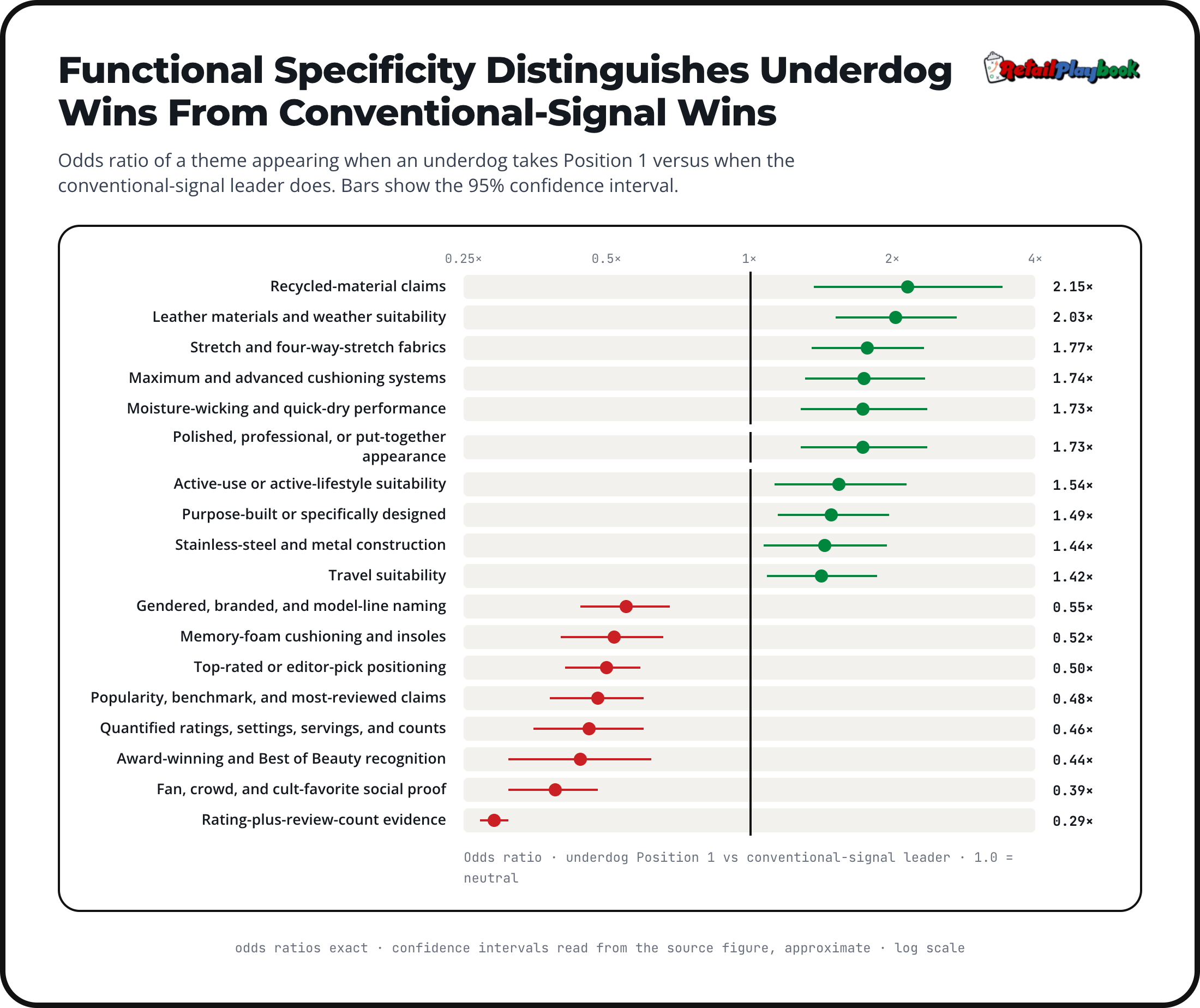
Figure F4. The plotted theme odds ratios compare rationales for underdog Position 1 wins with those for conventional-signal leaders.
Several functional and material themes are more common in the underdog group. These are odds of a theme appearing, not odds that changing a product page will secure first position; the displayed intervals are approximate.
F5. Read star ratings alongside review depth
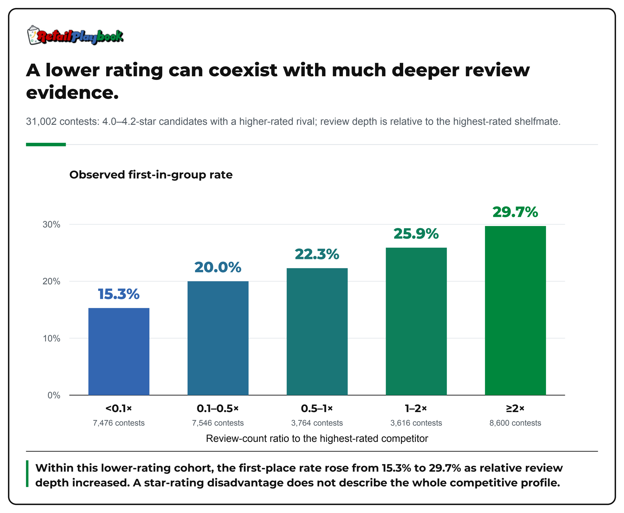
Figure F5. Within 31,002 contests involving 4.0–4.2-star candidates and a higher-rated rival, first-in-group rates rose from 15.3% to 29.7% across relative review-depth bands.
A rating disadvantage does not describe the whole competitive profile. Compare the volume of buyer evidence as well as the displayed average rating.
F6. Similar star ratings can accompany different positions
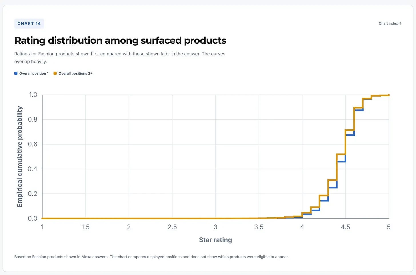
Figure F6. The Fashion rating distributions for first-position products and later products overlap heavily in the saved chart.
Star ratings alone offer limited separation here. Compare review depth, the exact offer and the shopping requirement alongside the rating; this chart covers displayed products, not the unseen candidate pool.
F7. Leading rationales emphasize some kinds of evidence
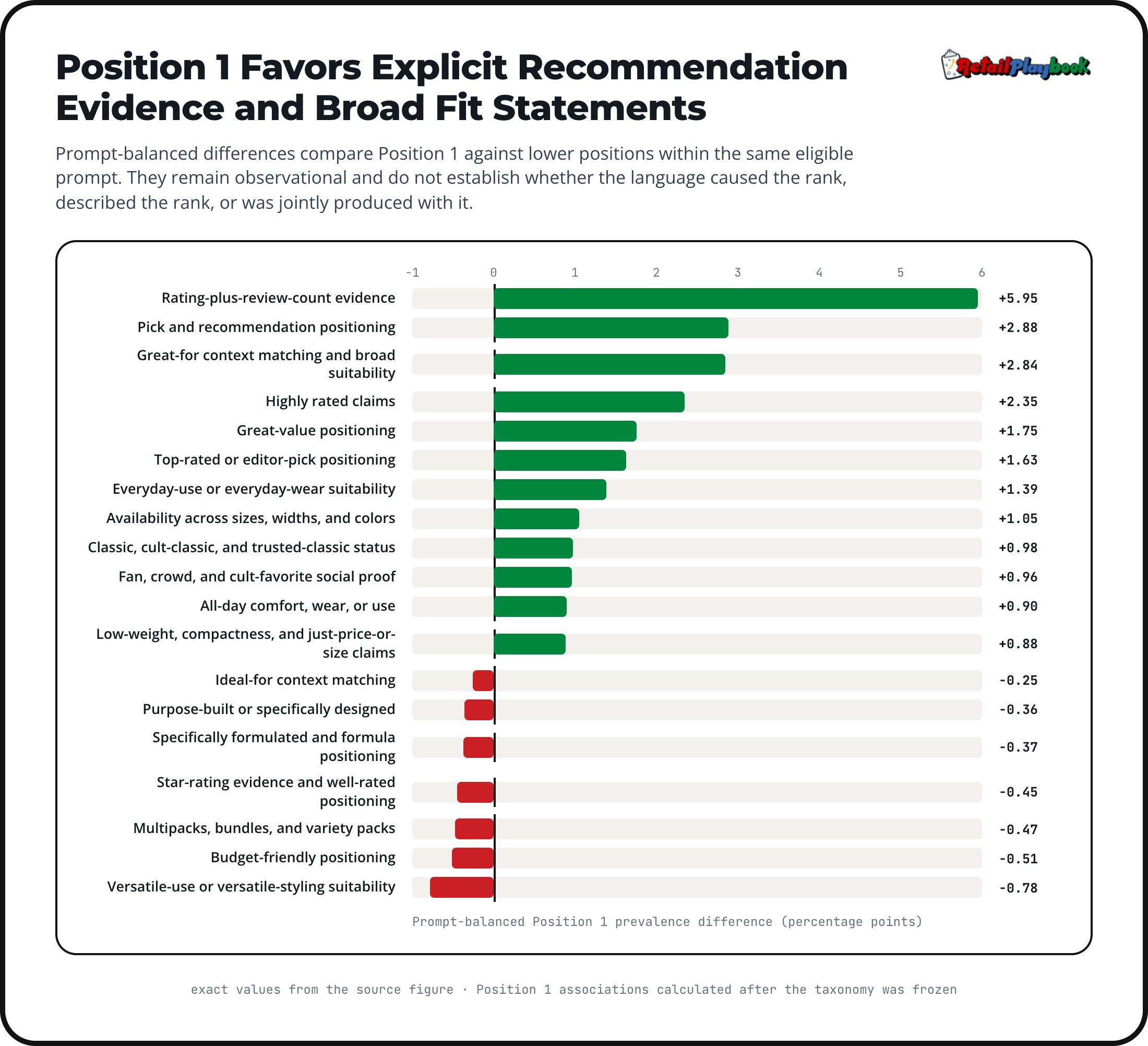
Figure F7. Prompt-balanced comparisons show more rating-plus-review-count evidence and explicit recommendation wording at Position 1 than at lower positions.
These differences describe the language accompanying placement. They do not establish whether that language caused the rank, described it, or was generated alongside it.
F8. Rationales carry request language differently from titles
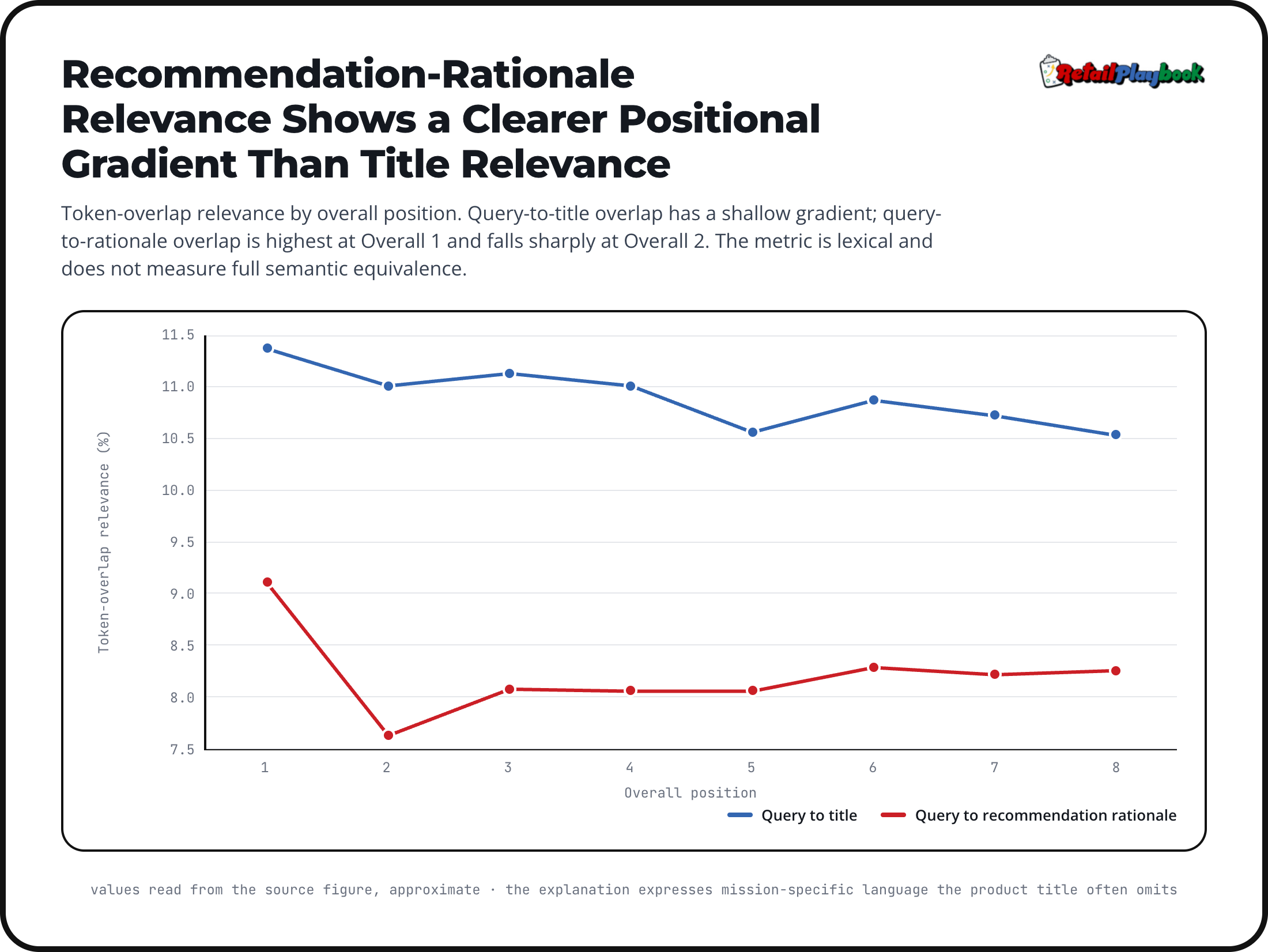
Figure F8. The approximate lexical-overlap chart shows a sharper first-to-second-position drop for query-to-rationale overlap than for query-to-title overlap.
Inspect the explanation as well as the title when checking whether the response addresses the request. Token overlap measures shared words, not full semantic fit.
F9. Start with the reasons that appear most often
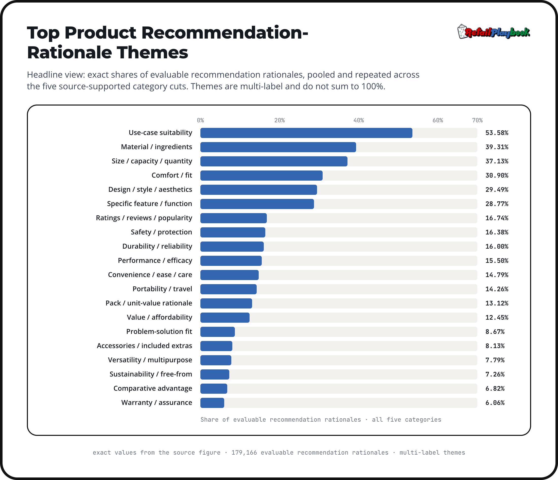
Figure F9. Across 179,166 evaluable rationales, use-case suitability is the most prevalent displayed theme, followed by material or ingredients and size, capacity or quantity.
These overlapping themes identify useful questions for a content audit. Their shares do not sum to 100%, and a pooled pattern still needs checking within the product’s category.
F10. Different categories need different product facts
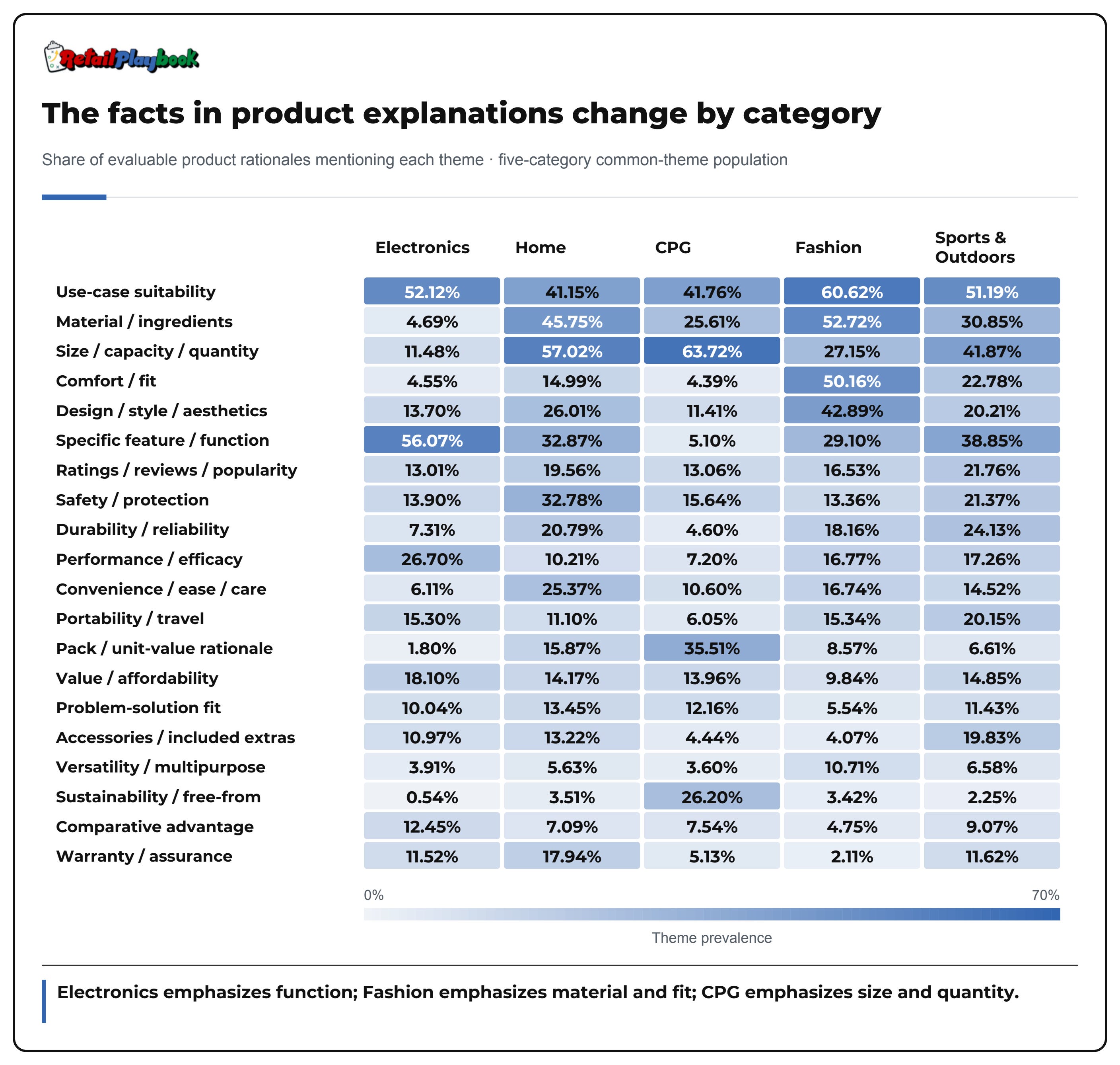
Figure F10. Across the five-category rationale population, Electronics emphasizes functions, Fashion emphasizes materials and fit, and CPG emphasizes size and quantity.
Use category-specific questions to prioritize product-page coverage. The themes overlap, so the percentages are not slices of a single whole.
F11. Some rationale themes appear together
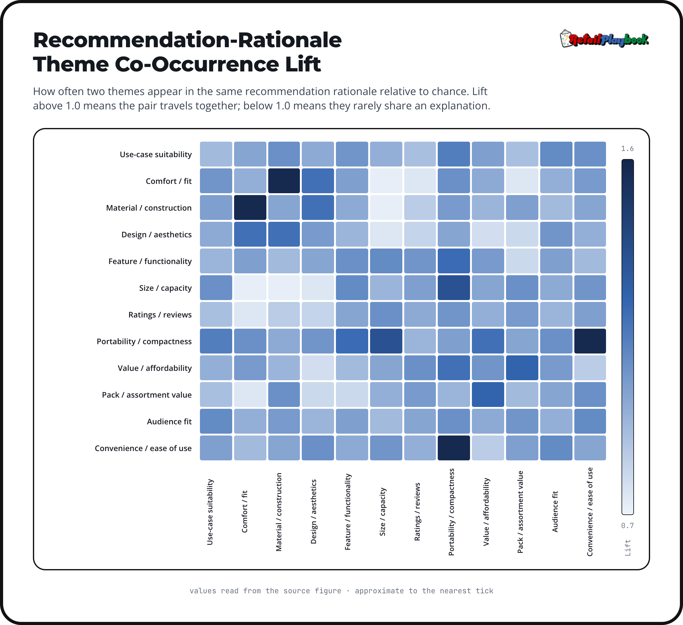
Figure F11. The heatmap compares observed theme co-occurrence with what independent frequency would predict; values above one indicate more frequent pairing.
Look for combinations such as material and comfort when auditing a product story. Shared phrasing can influence coded associations, and the displayed values are approximate.
F12. Connect the shelf’s promise to the product’s explanation
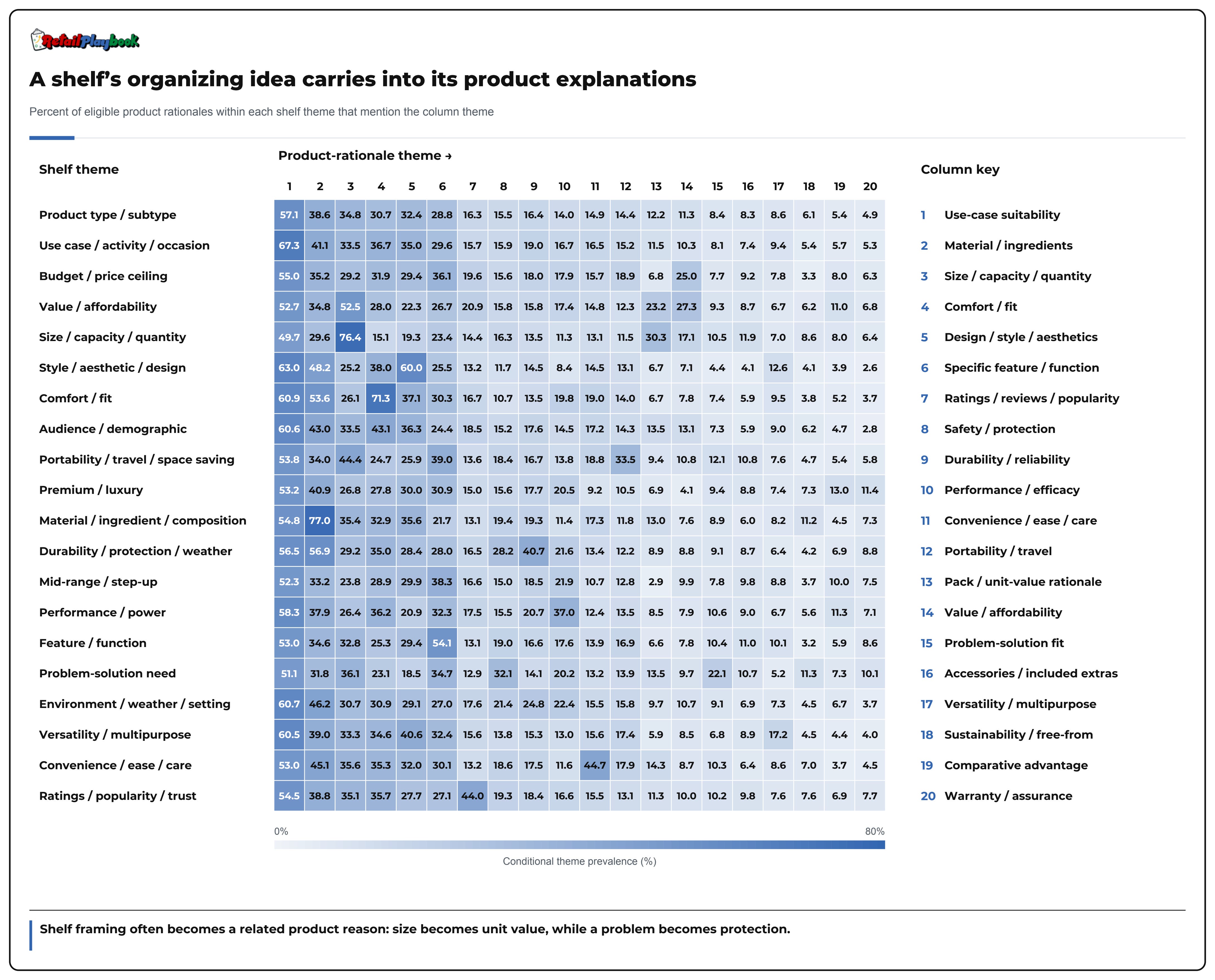
Figure F12. The shelf-to-rationale crosswalk maps product-explanation themes within 161,189 eligible linked cards.
Read the shelf label and the reason beneath each product together. A product page should substantiate the benefit relevant to that grouping, rather than merely repeat a broad category claim.
F13. Look for the requirement on the right surface
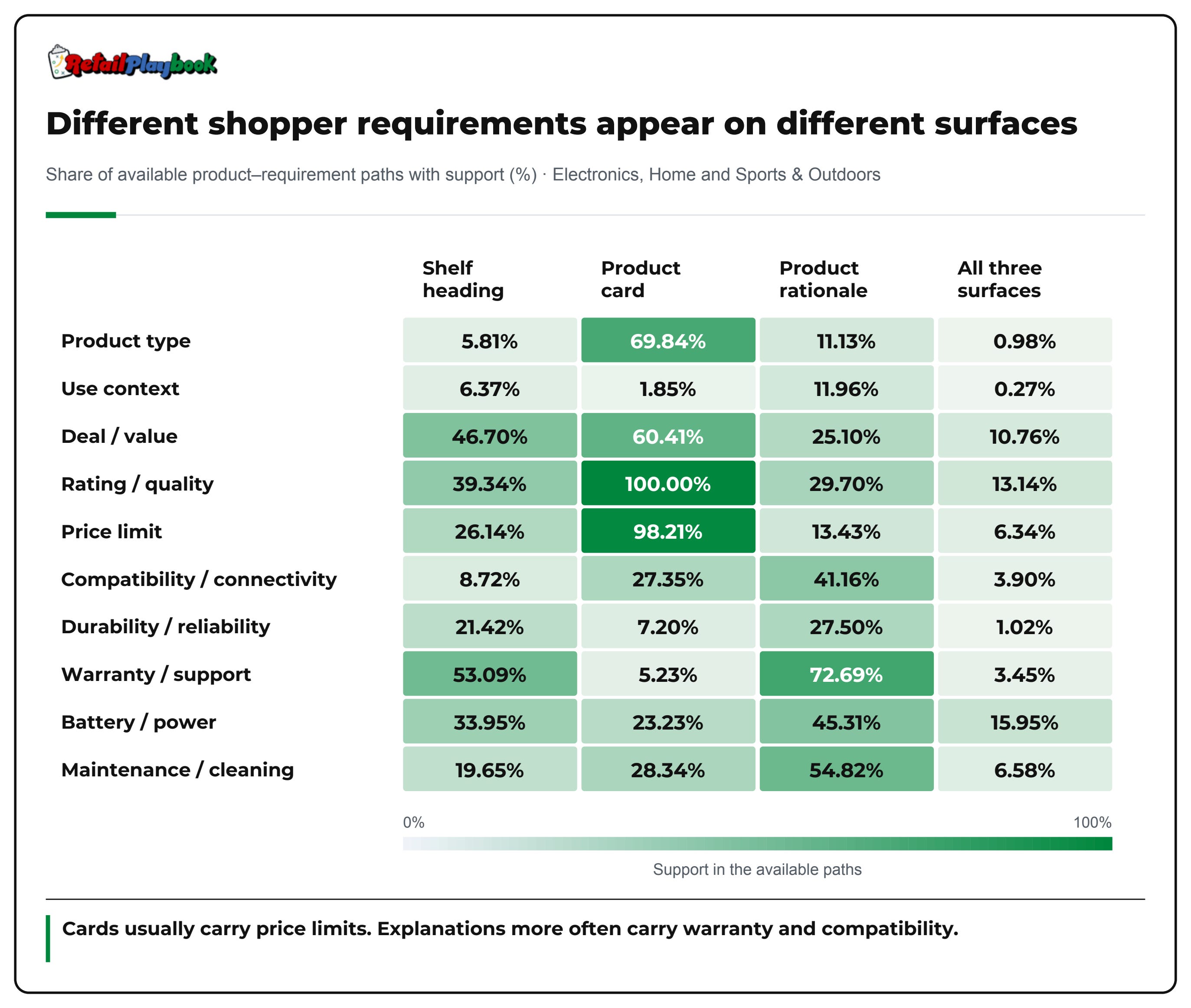
Figure F13. In the available Electronics, Home and Sports paths, price limits are usually supported on cards, while warranty and compatibility more often appear in explanations.
Inspect headings, cards and rationales together. These registered support measures are not an overall factual-accuracy score.
F14. Some shelf themes appear first disproportionately often
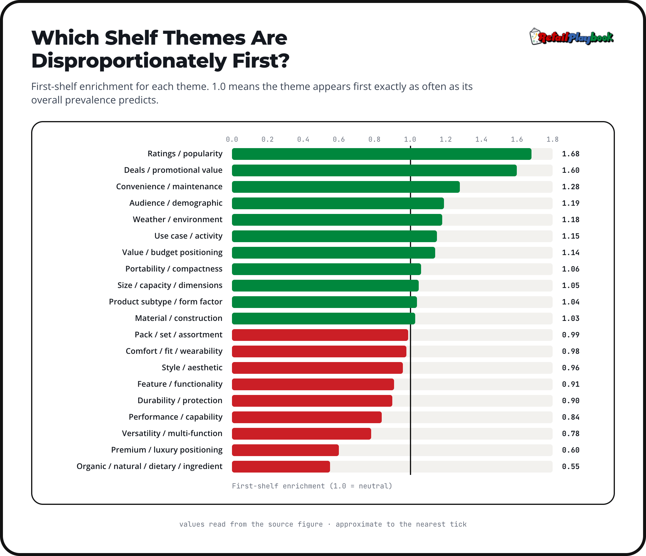
Figure F14. First-shelf enrichment is above one for ratings/popularity and deal/value themes and below one for several premium and specialty themes.
The ratio compares first-shelf representation with overall theme prevalence. It is a descriptive placement pattern, not a probability or an instruction to make every product sound inexpensive.
F15. The card distribution has a long, thin tail
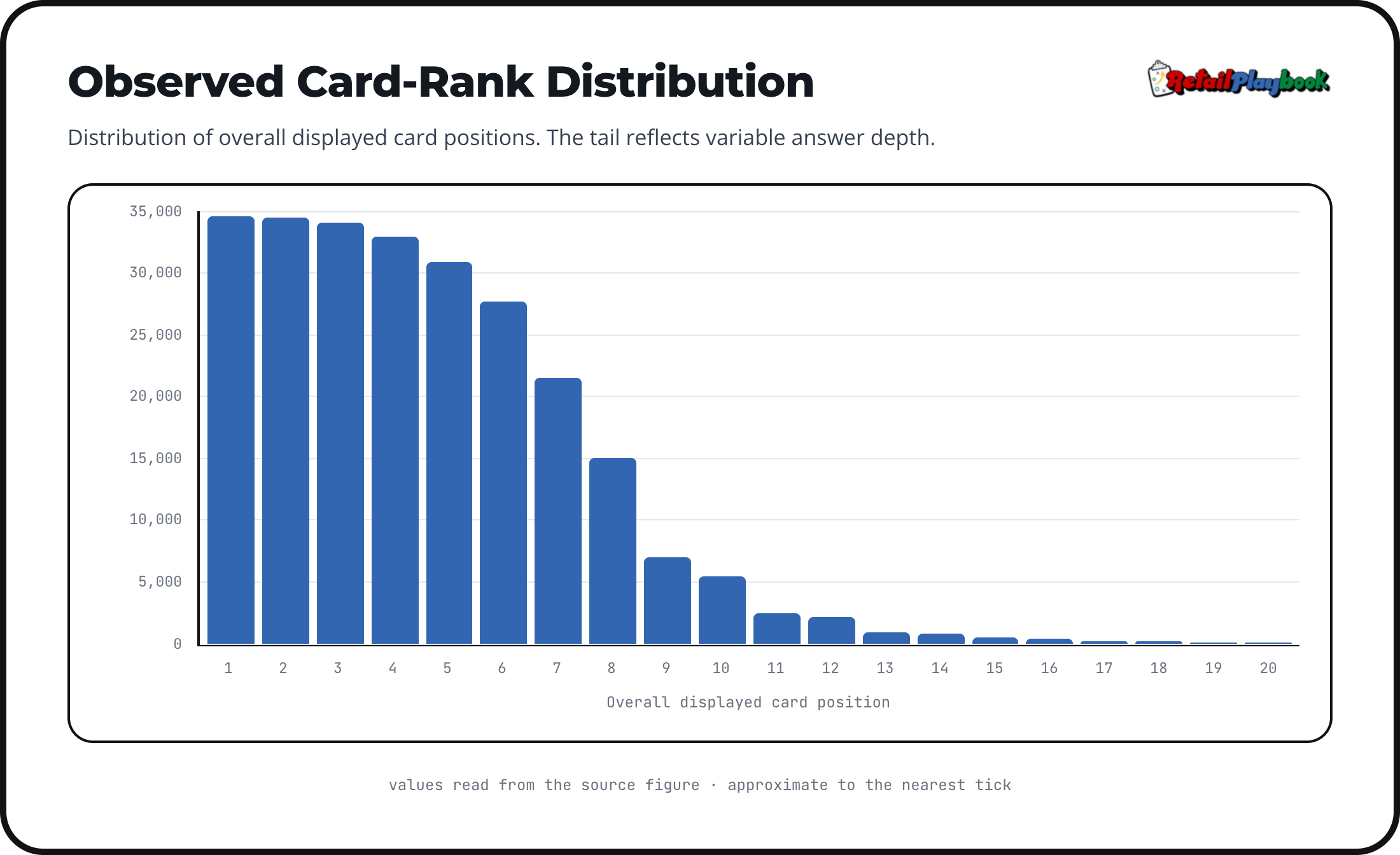
Figure F15. The observed card-rank distribution contains many more early-position cards than late-position cards.
Check the number of observations behind each position before comparing means, medians or percentages. The tail reflects variable answer length, not an estimate of how many shoppers viewed each card.
F16. The leading publisher changes inside a broad category
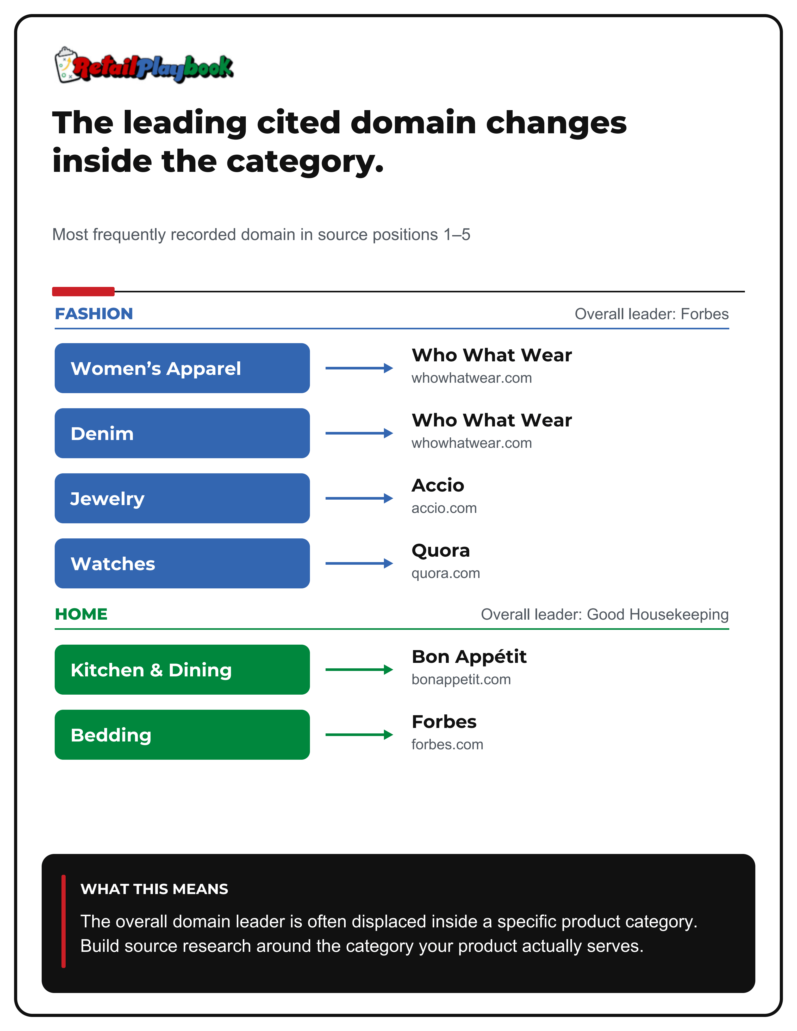
Figure F16. Within Fashion, the displayed leaders include Who What Wear for women’s apparel and denim, Accio for jewelry and Quora for watches; Home also divides by subcategory.
Build the source audit around the product category you actually serve. A broad category’s leading domain does not have to lead every part of it.
F17. Even a leading source has incomplete reach
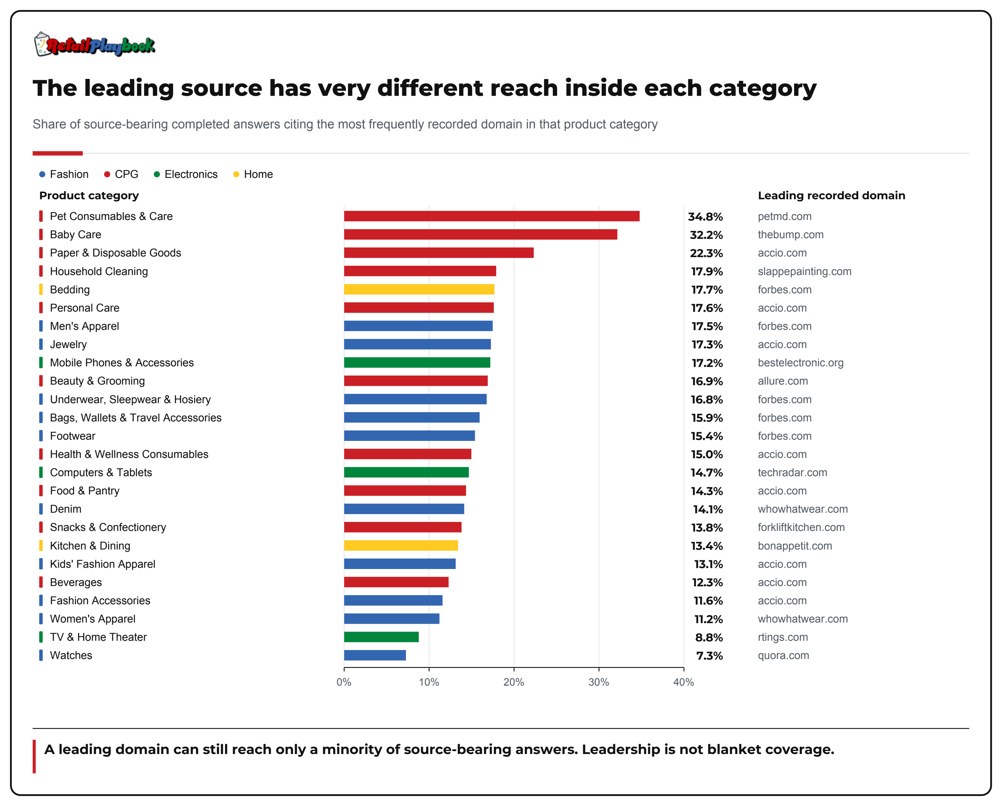
Figure F17. The most frequent domain’s reach varies substantially across product categories when measured among source-bearing completed answers.
A single publisher relationship cannot represent the full observed source landscape. Check the relevant product category and note that this denominator differs from all completed answers.
F18. Brand leadership depends on the shopping mission
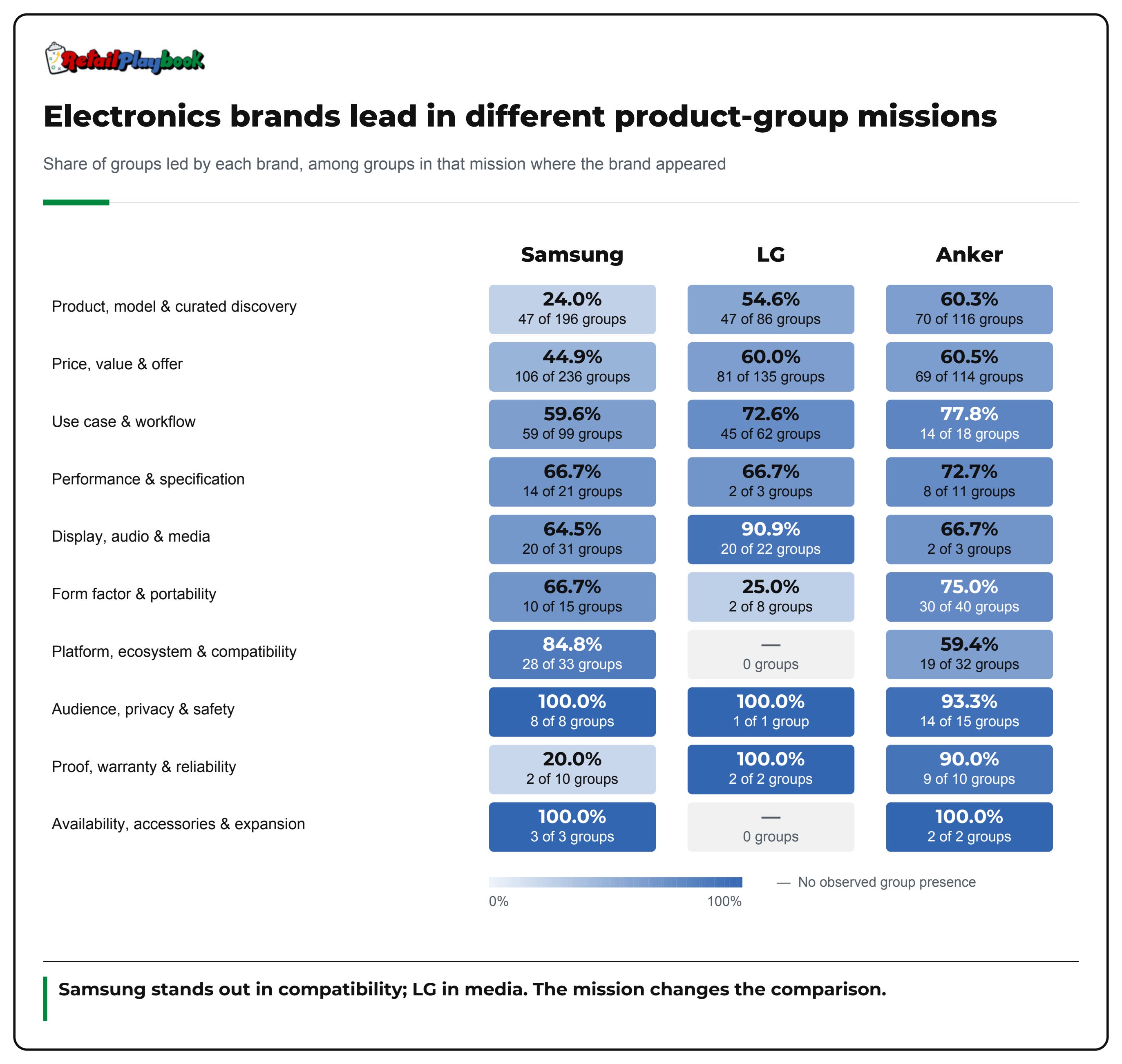
Figure F18. The Electronics matrix compares first-in-group rates for Samsung, LG and Anker, conditional on each brand appearing in that mission.
This helps locate a competitive strength or gap within a specific requirement. Small cell counts and conditional inclusion matter; these are not category-wide market shares.
Building a Production Shopping Agent at Scale · Chen Luo et al.; SIGIR 2026; PDF p. 3, sections 4.1 and 4.3.
Language Model Alignment for Conversational Shopping at Amazon · Chen Luo et al.; SIGIR 2025; PDF p. 4, section 3.2.
Accio User Guide · Accio primary product documentation; accessed October 3, 2026.
Full-Chain Product Sourcing and Publishing Package Delivered · Accio published workflow example; accessed October 3, 2026.
Pyrex Simply Store 3-cup rectangular glass food storage container with red lid · Manufacturer SKU 1075430; Product Details, Dimensions and Capacity; inspected October 2, 2026.